Product Objective: Responsive Website
Role: UX/UI Designer
Date: 2022
Length: 4 weeks
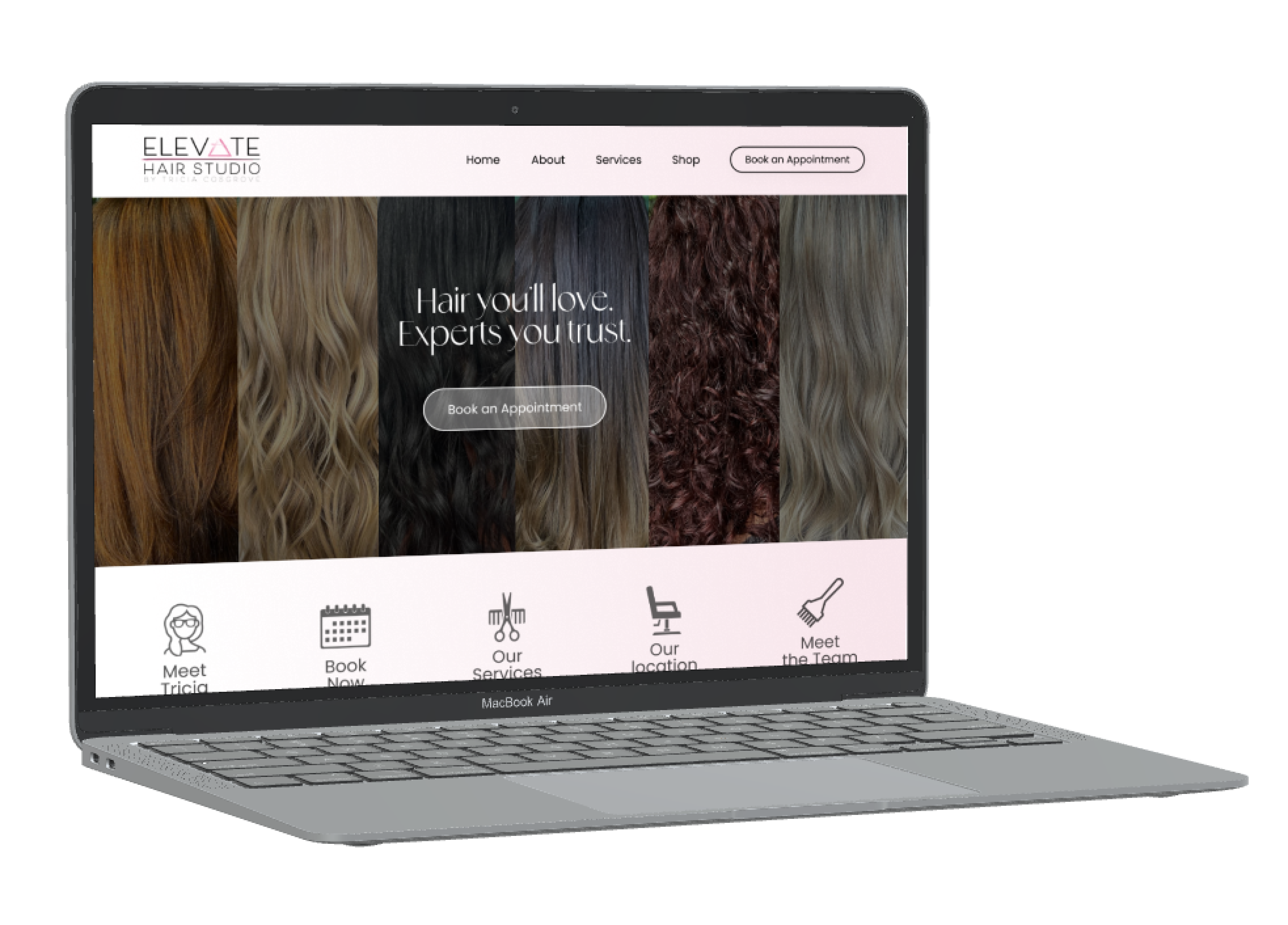
Elevate Hair Studio is a full-service hair salon in downtown West Chester Pennsylvania. They offer a variety of services from haircuts and color to extensions and wedding hair. Their website is used by current guests to view updated information on the salon and to schedule appointments. It is also used to welcome prospective guests to learn about the salon, the stylists, and the services, and to schedule their first appointment. The main goal of this redesign is to provide these different types of users with an experience as enjoyable as visiting the salon. Responsiveness will remain at the forefront of this design due to the variety of users and their device preferences.
Background
I was tasked to redesign Elevate's current website to be more accessible, visually appealing, and user-friendly. There were a few usability issues that needed to be addressed: readability, blurry images, incorrect proportions, padding issues, lack of clear user/task flow, and lack of pertinent information. My main goal is to maintain a modern sleek aesthetic while providing a simple and accessible design that benefits all users.
The Problem:
Elevate's current UI has some usability issues - pixelated images, crowded icons, lacking a bold call to action on pages, and poor readability.
The Solution:
Create a modern and fun redesign with a strong focus on readability, responsiveness, visual balance, and clear flow.
The Original Elevate Website
Empathize and Define
Industry & Comparative Research:
The website is the first introduction a prospective guest has to the business. An appealing, accessible salon website is imperative to maintaining and building a guestbook.
70% of people prefer to book appointments online.
You want to target two audiences, the new guest and the current guest, to make each party feel like the priority within the same design.
User Interviews: Top Findings
Interviewees consited of 3 Elevate guests and 1 non-guest.
All interviews were conducted virtually over Zoom or Facetime.
50% of interviewees said they would use a mobile device to book an appointment and the other 50% would use a computer.
Some keywords users offered when asked what represented the website were “pink, simple, cookie cutter, and professional.”
Widespread concern about readability and difficulty finding where to book an appointment.
User Personas
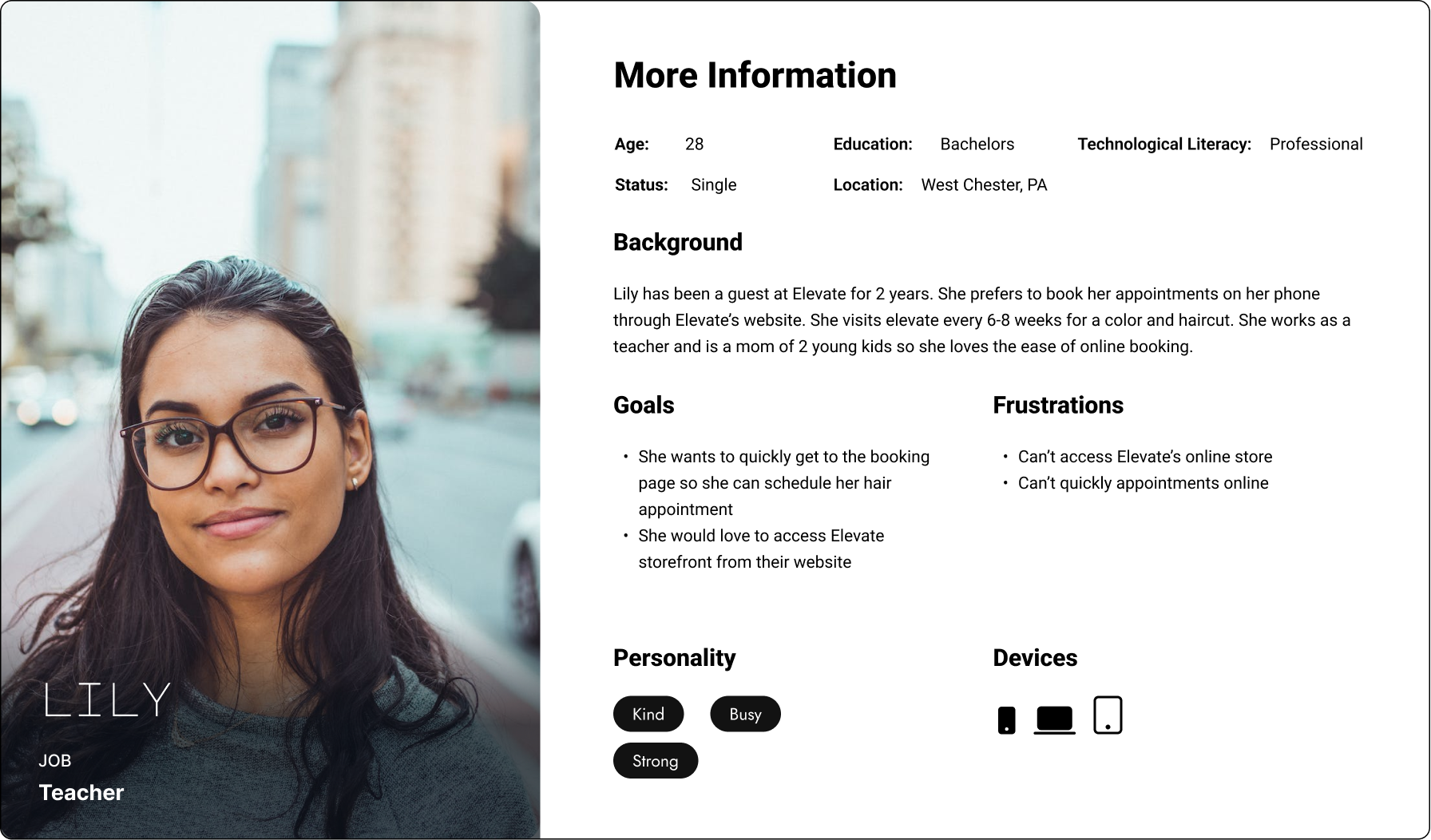
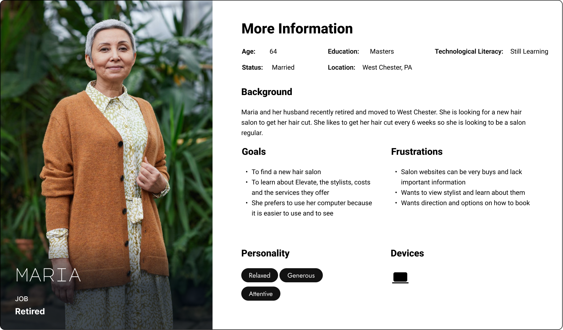
Using the data from the user interviews I developed user personas of current and potential Elevate guests. These two personas pinpoint the main goals of users when they visit Elevate's website. Responsiveness is key in this design due to varying device preferences.
Ideate & Prototype
Task Flows
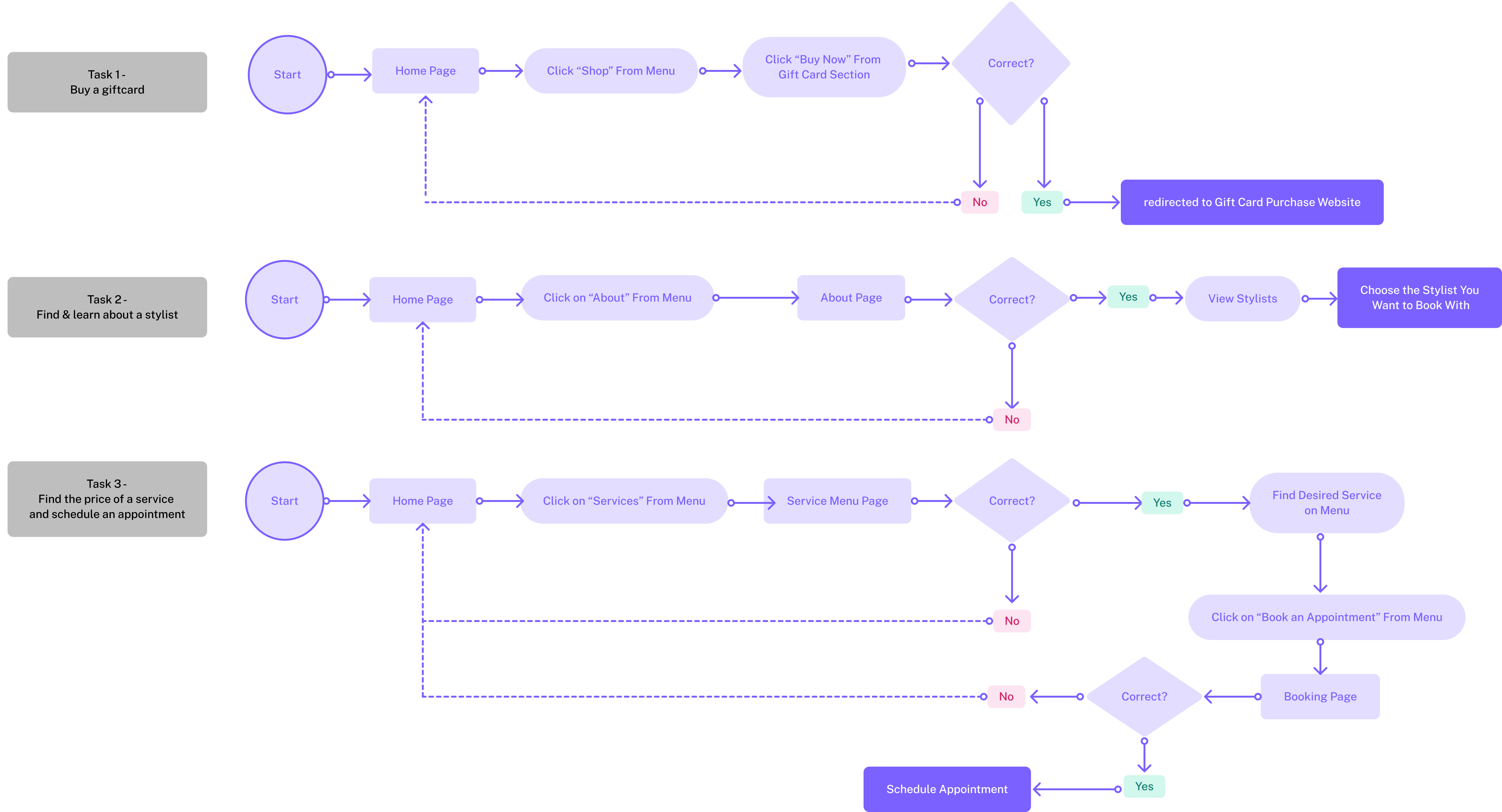
These 3 task flows represent 3 flows a user may go through while using Elevate's Website.
Low Fidelity Wireframes
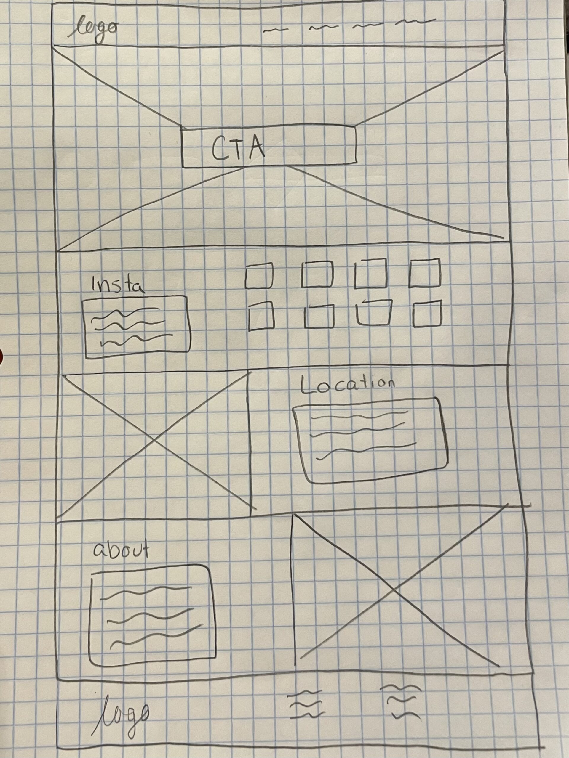
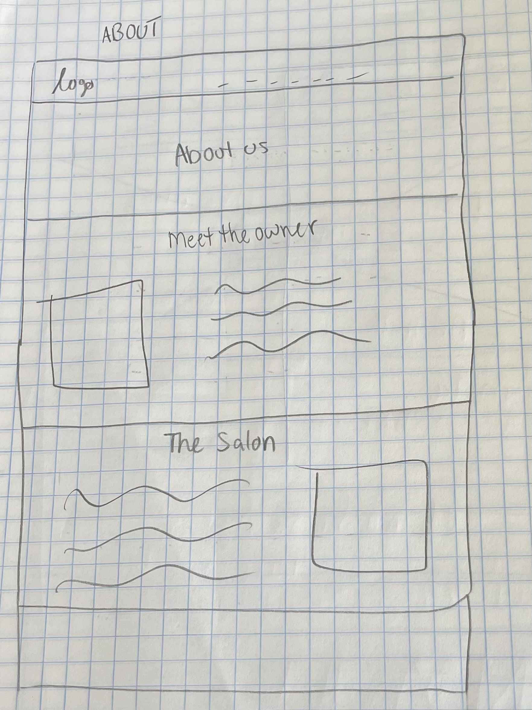
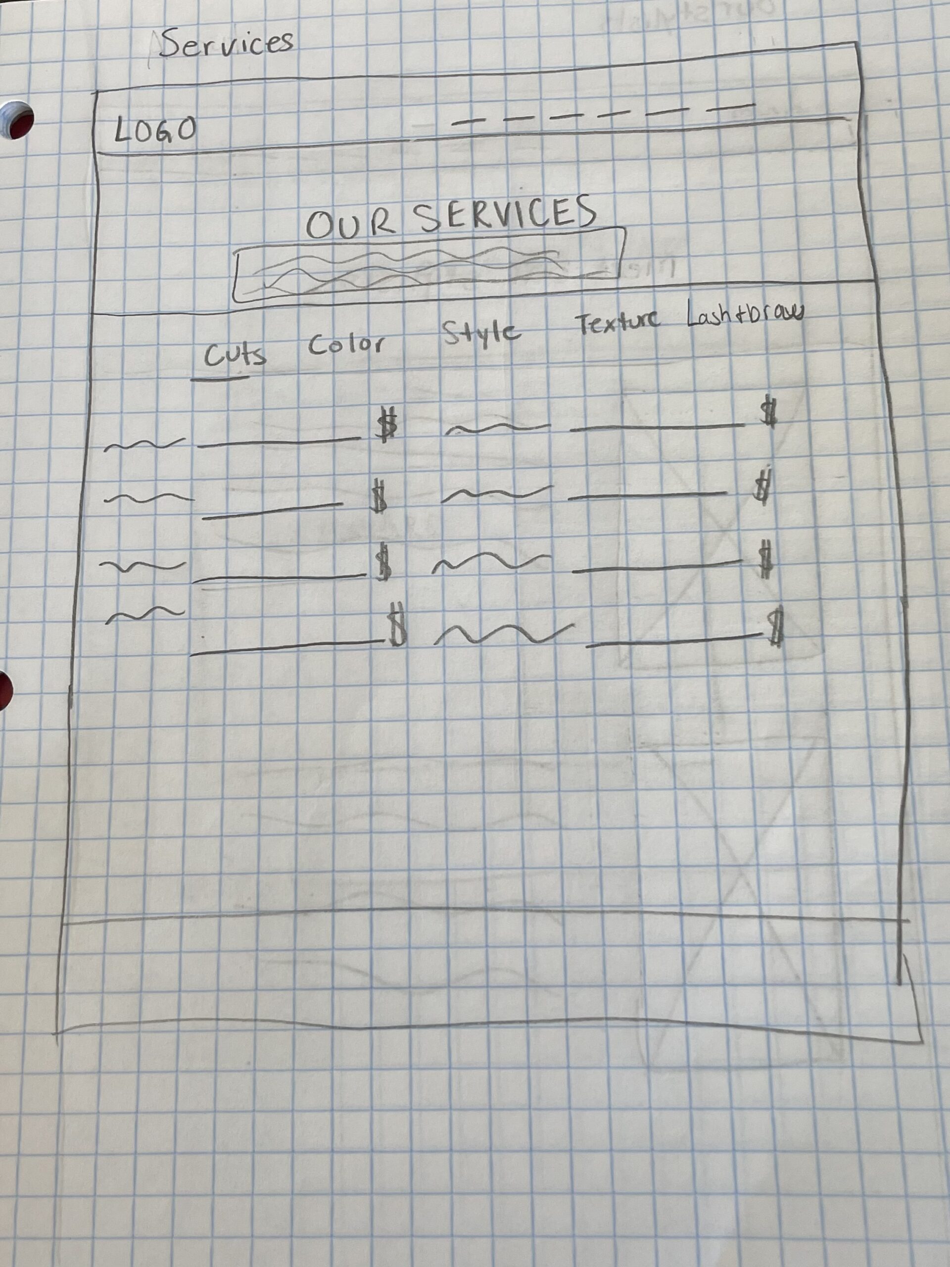
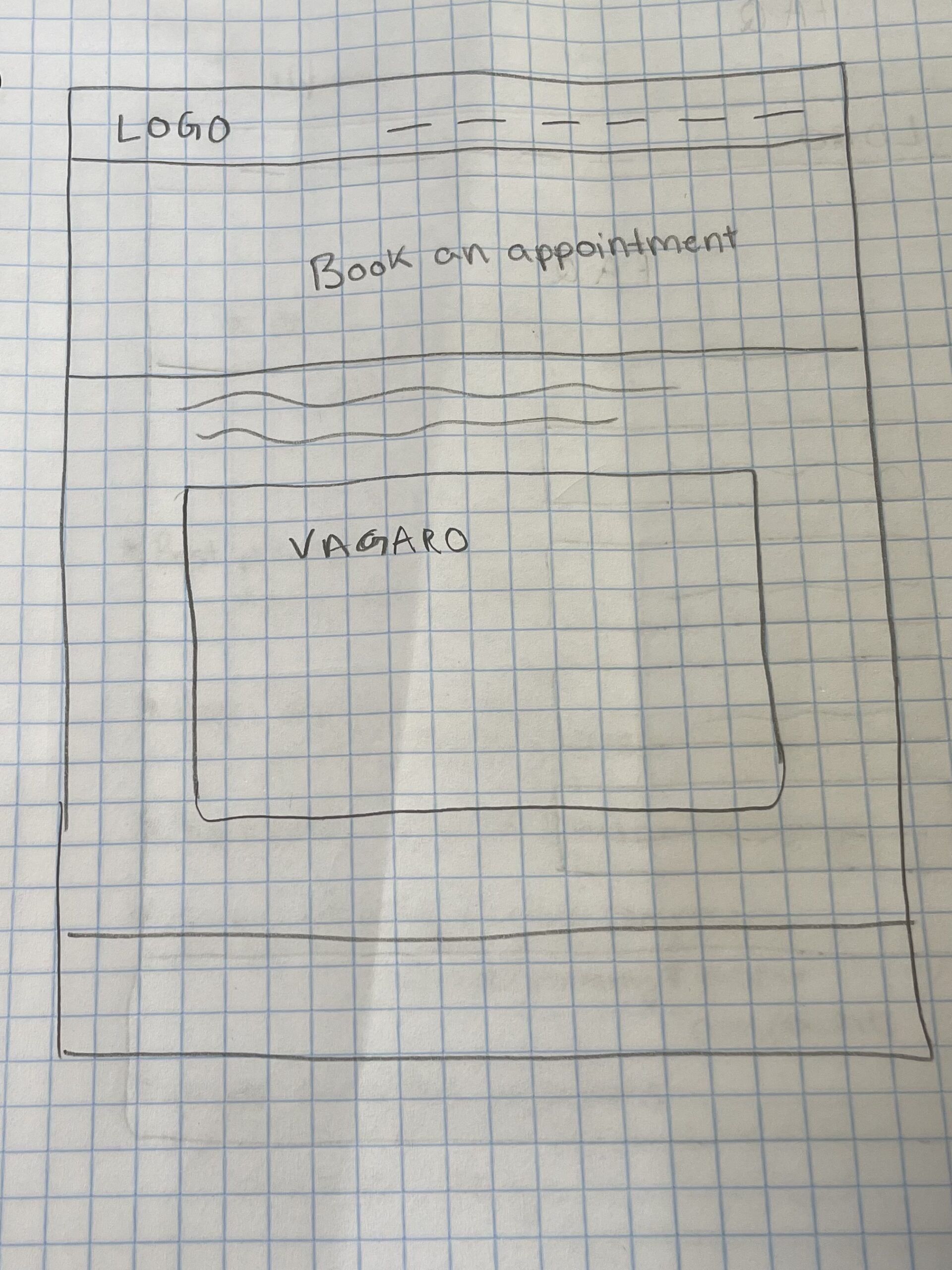
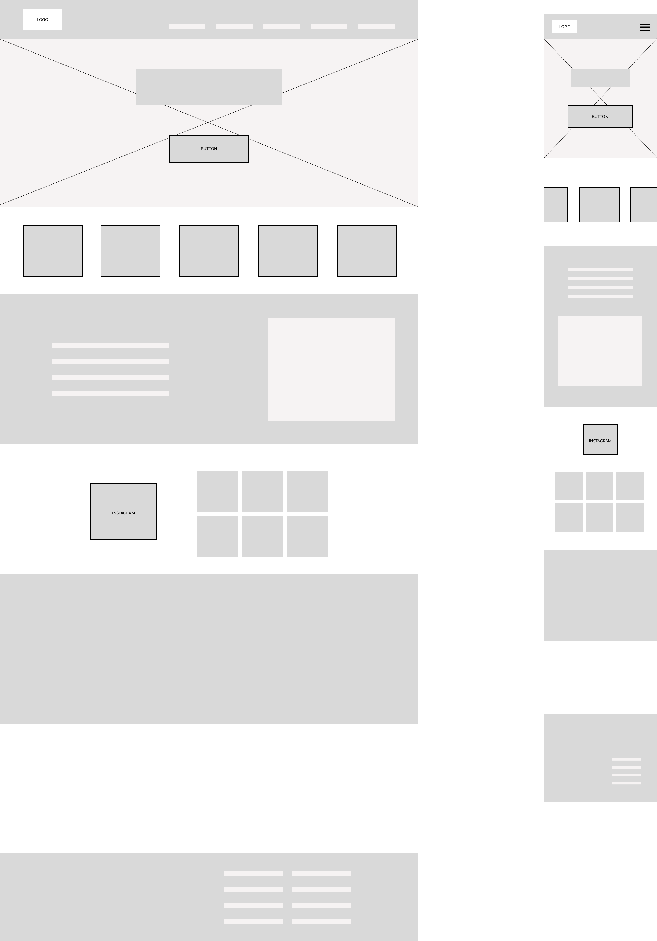
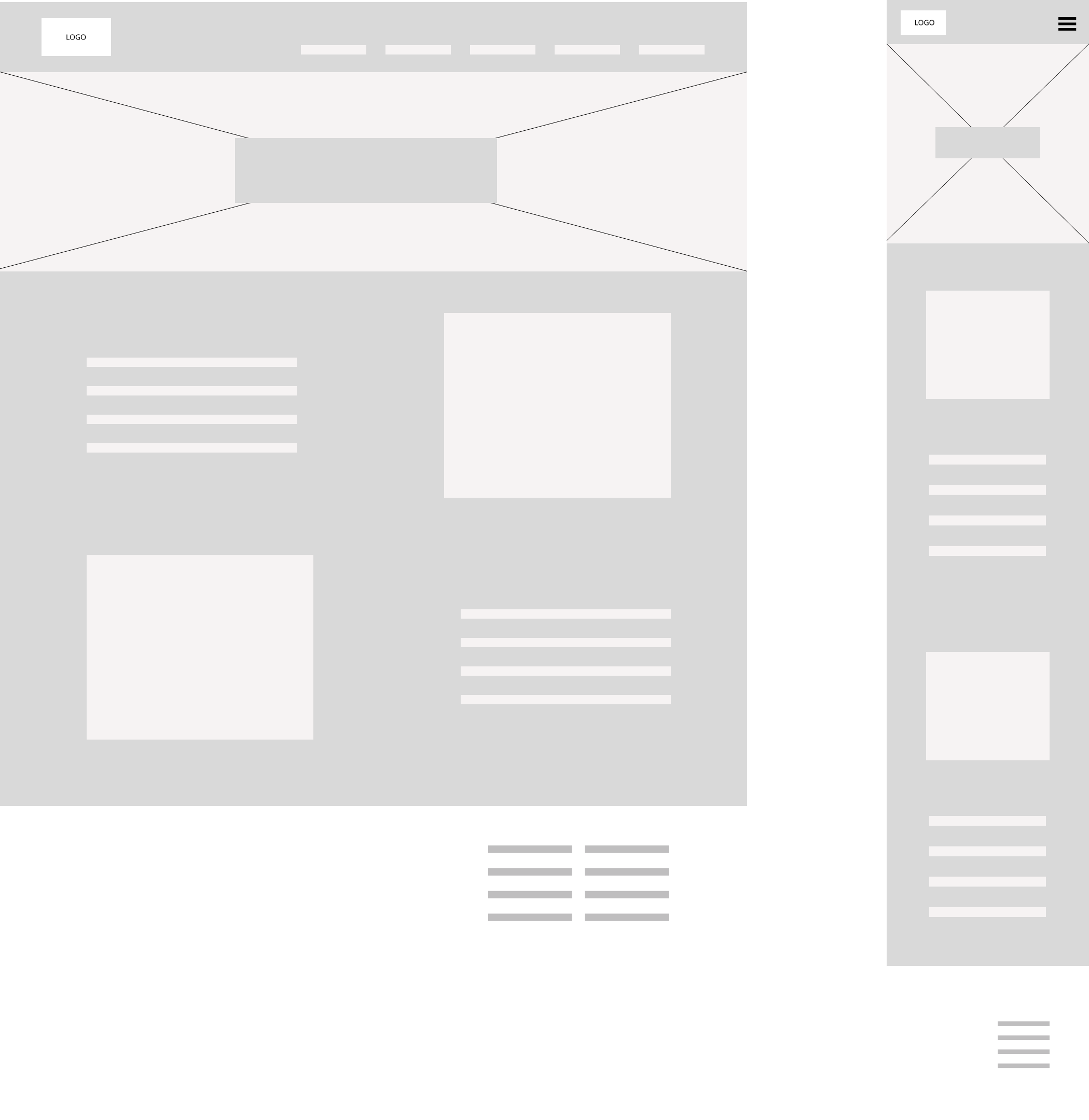
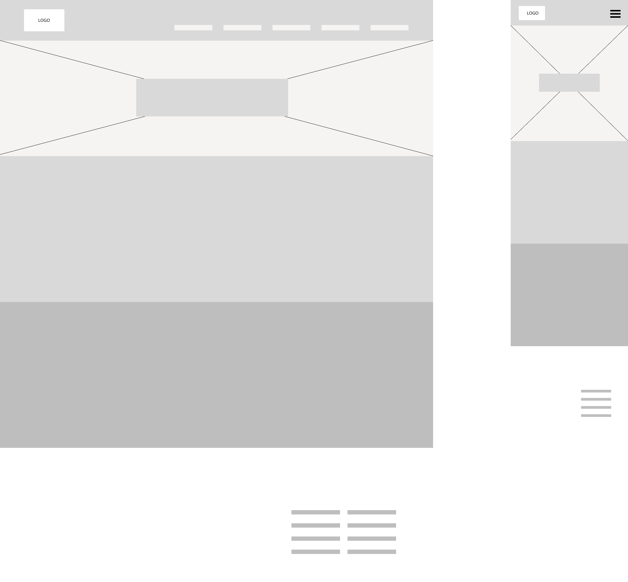
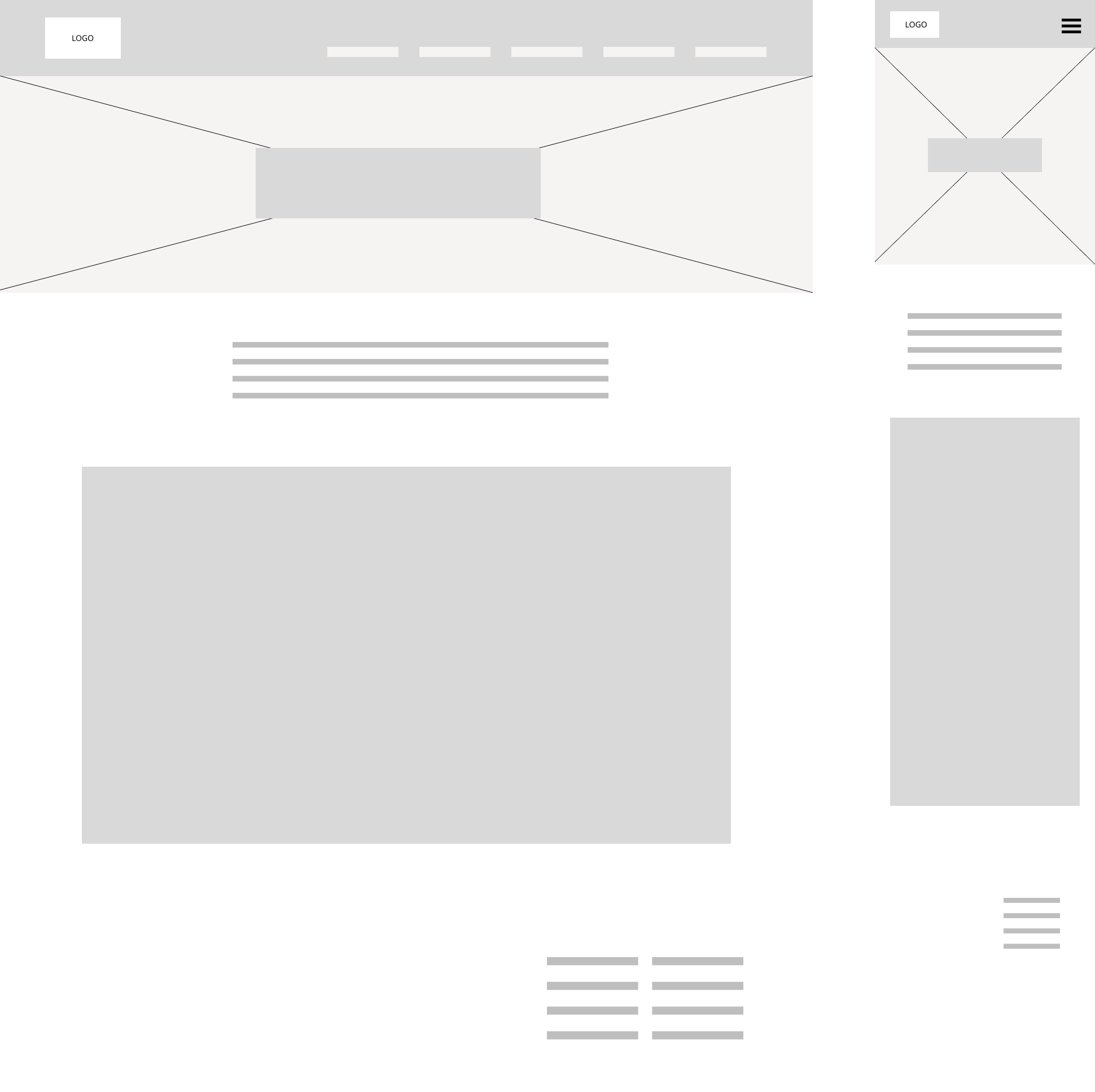
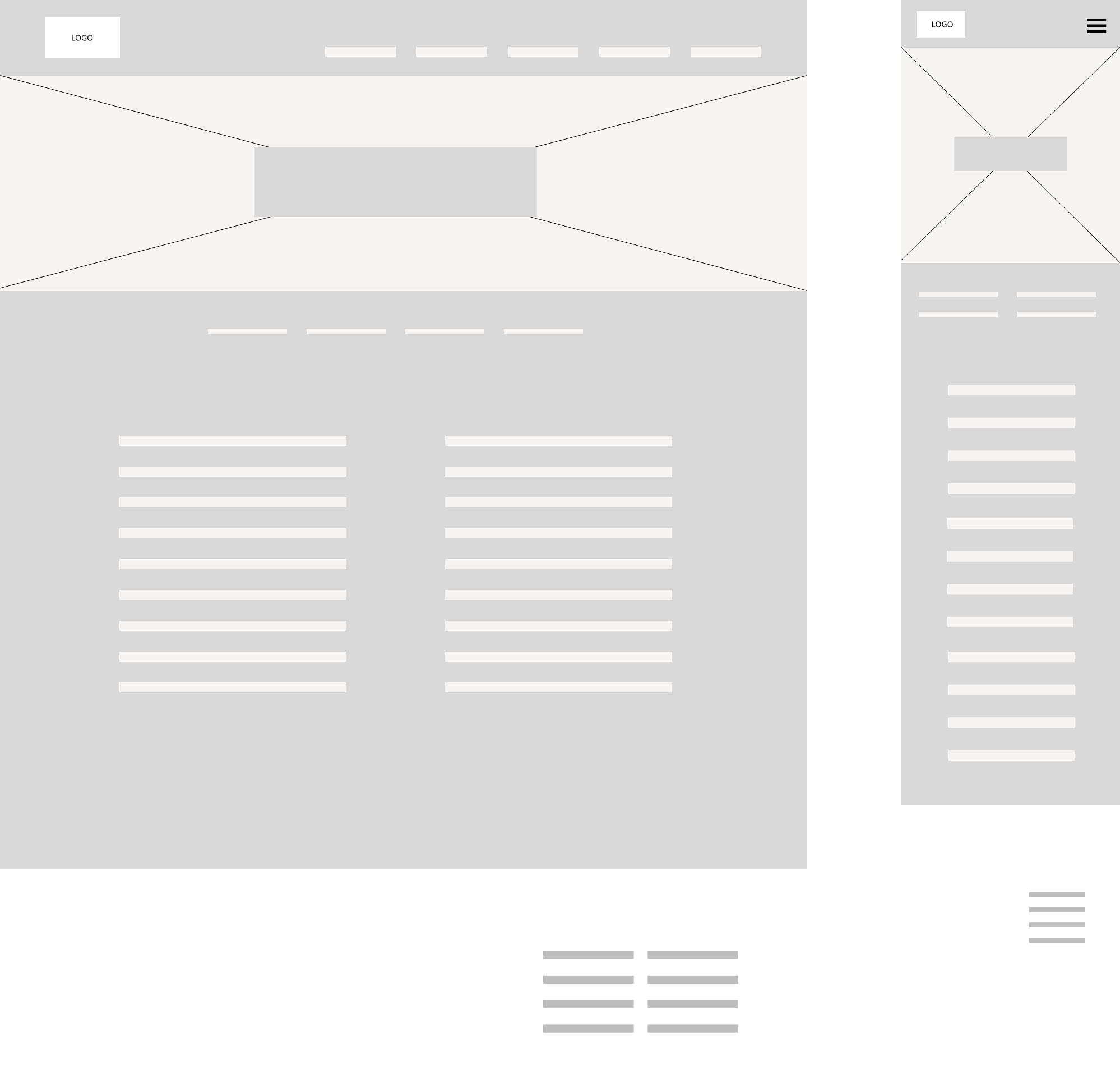
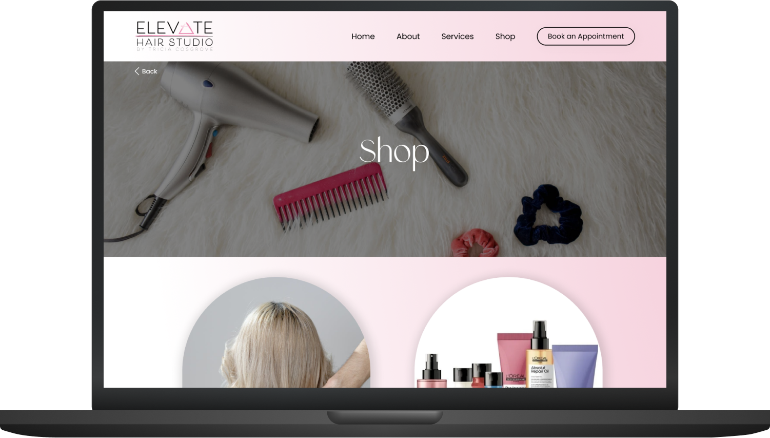
These preliminary sketches represent a few potential designs: a home page, about, service menu, & booking. Following the sketches are the digitized low-fidelity wireframes for these screens and a screen for the shop page.
Style Guide
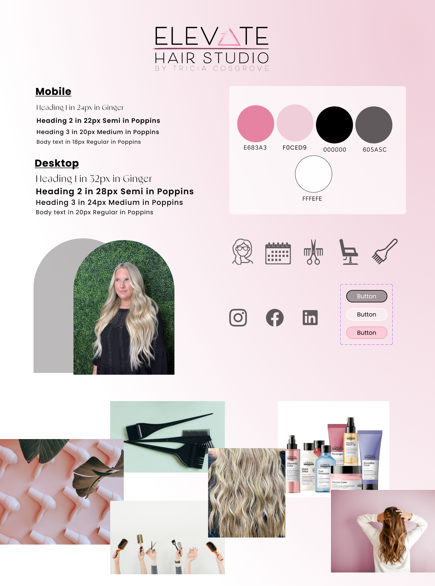
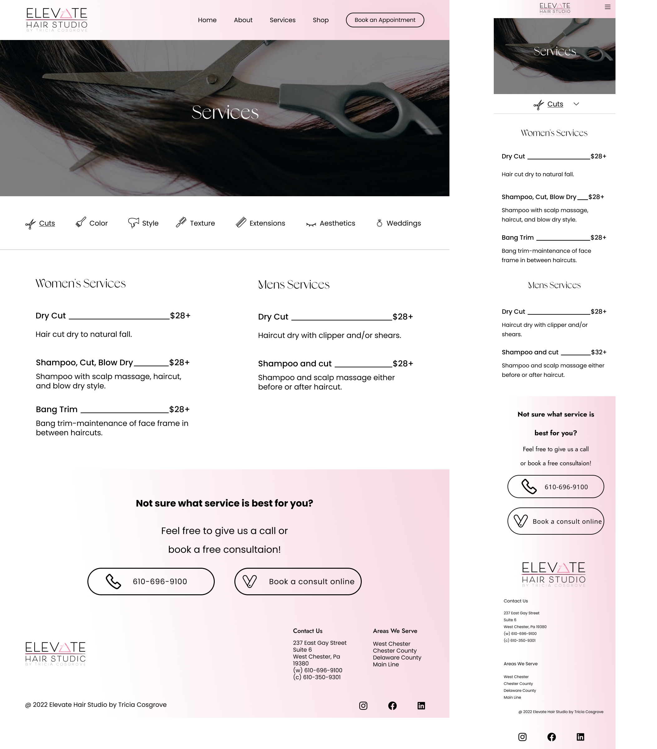
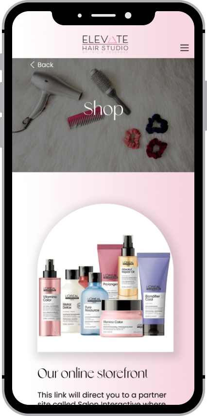
While there was no rebranding done, I adjusted Elevate’s current elements to create a more mature and visually pleasing design. The current font felt a little too plain. I updated the title font to Ginger which provides and more playful and updated feel. The body font I chose is Poppins. I wanted to keep the font sans serif for the sake of simplicity and readability. I liked the use of pink on the original website but the full opacity pink felt too bright so I lightened it up a bit and added a gradient to maintain contrast but not take away the focus of the content.
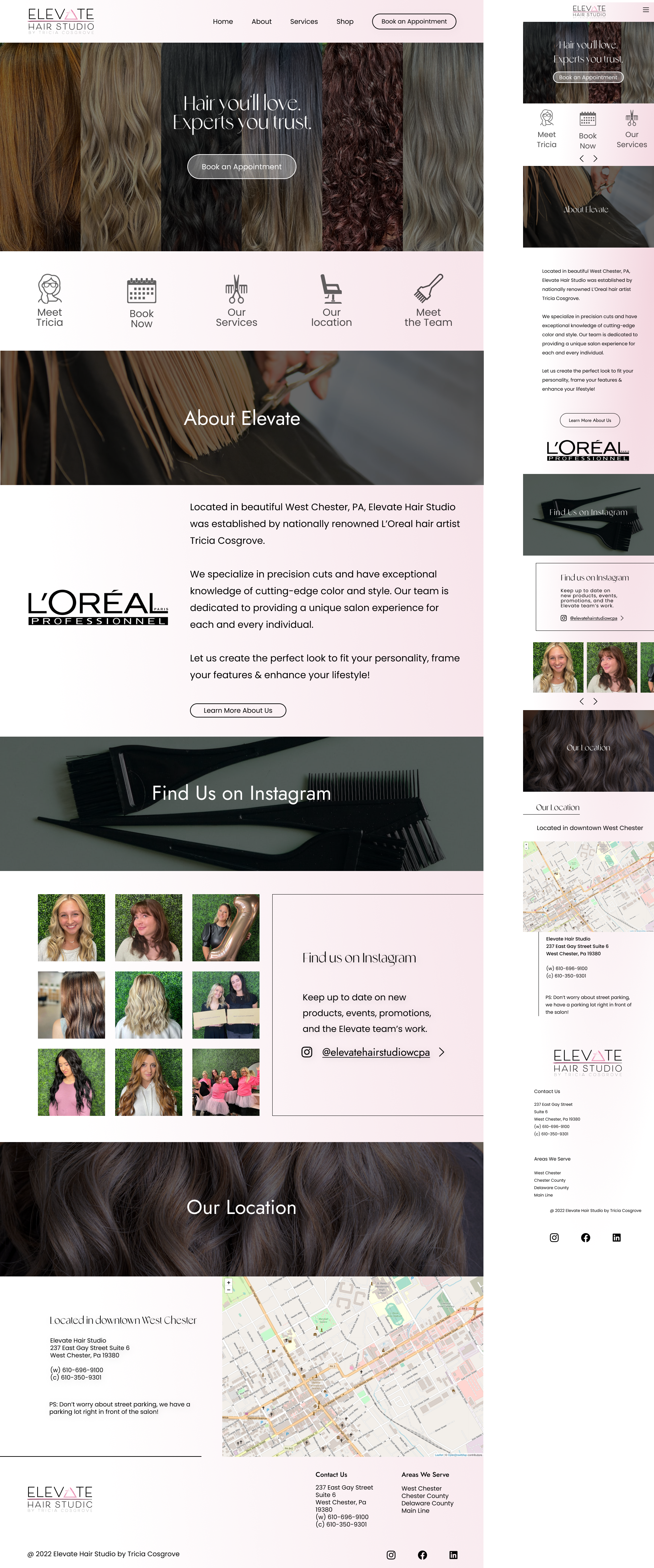
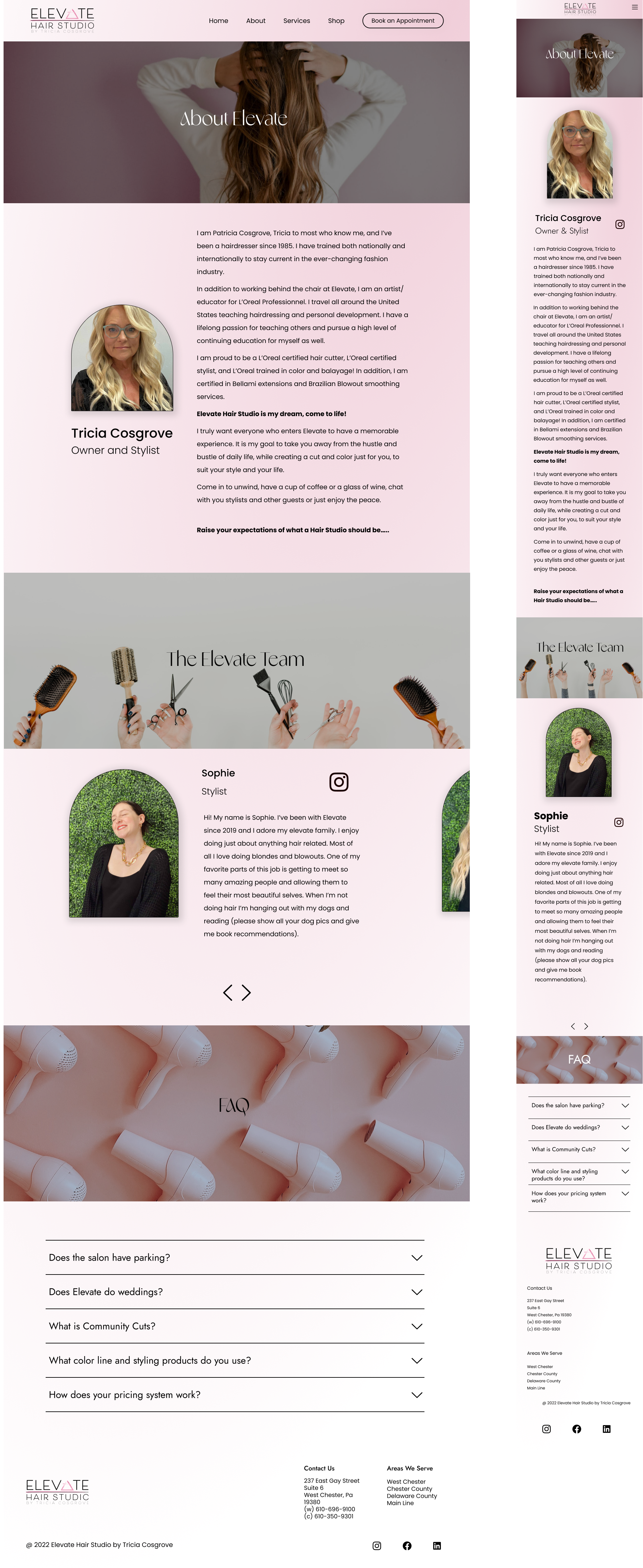
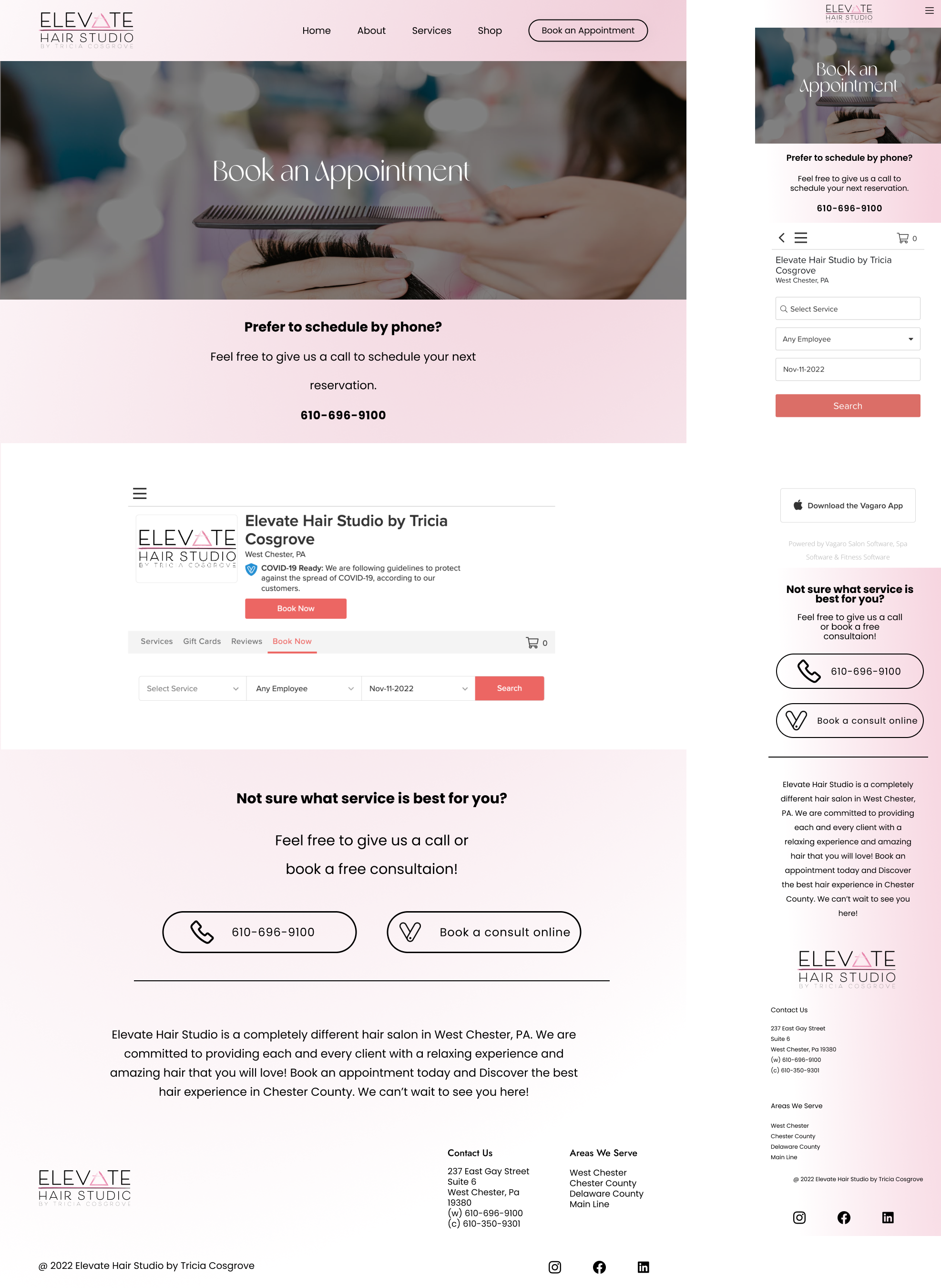
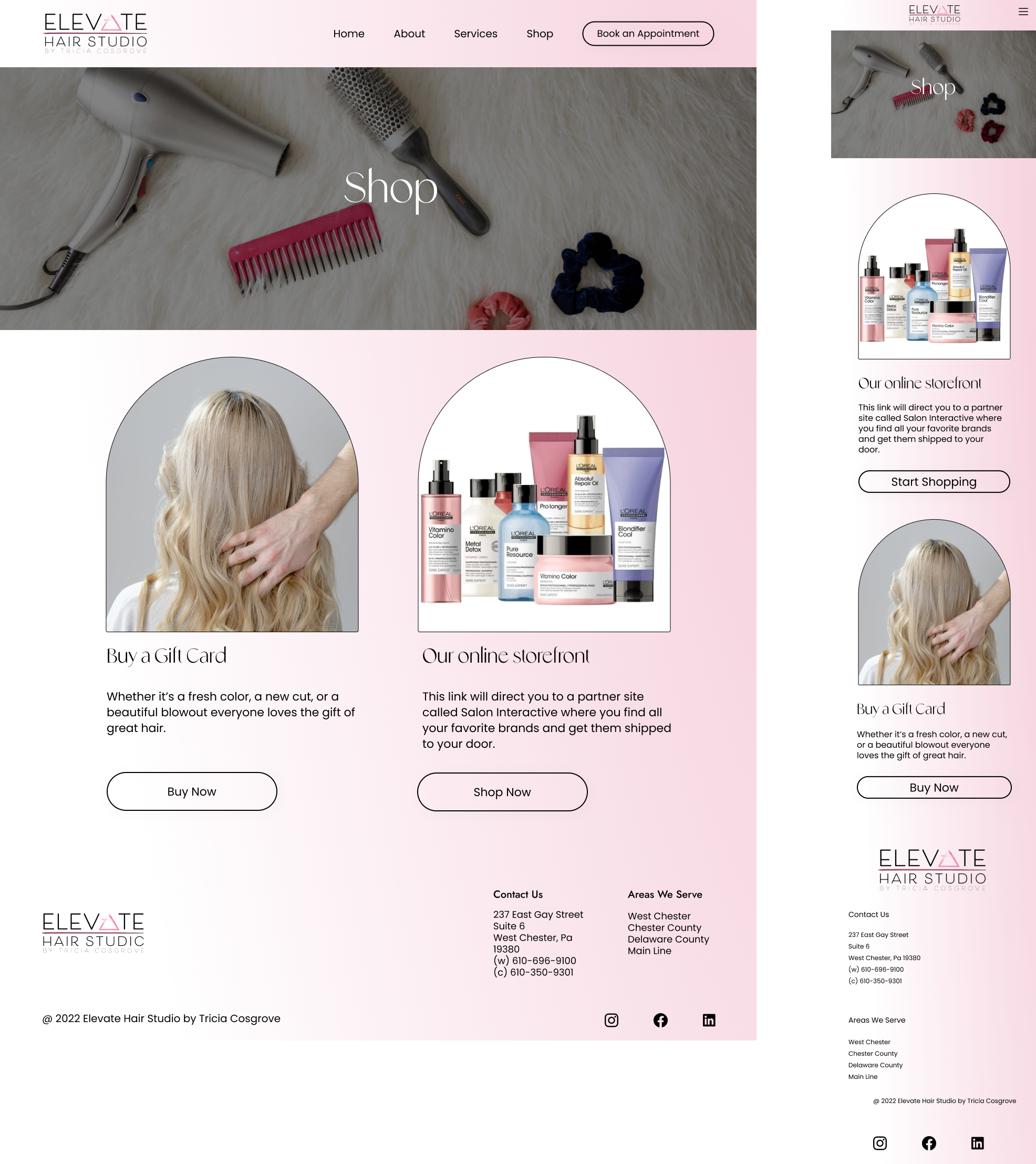
High Fidelity Wireframes
Test & Iterate
Usability Testing
Tested 3 different task flows with 4 users.
Flow 1:
Buy a gift card
Flow 2:
Find & learn about a stylist
Flow 3:
Find the price of a service and schedule an appointment
Research Goals & Results
Determine how easily users are able to complete a task.
Flow 1 (buy a gift card) was the easiest flow
Different users showed a strong preference for either using the menu or using the icons on the home page, there is not a lot of crossover
Many users used words like "simple" and straightforward" to describe the design, emphasizing ease of use
Determine if the design has been improved by comparing the same task on the old design and the new design.
The task was completed faster on average in the new design vs the old design.
The old design was focused on users automatically utilizing the icons on the home page but not all users follow that navigational flow, many users' first instinct is to check the hamburger menu.
Determine any points of common error or confusion.
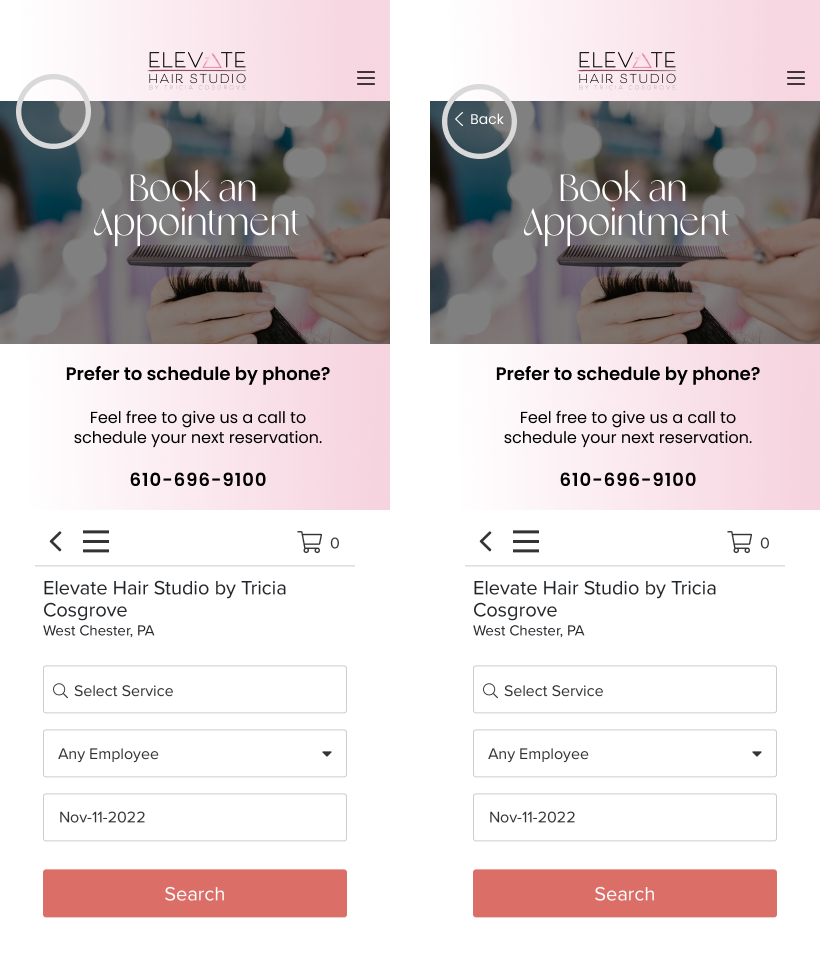
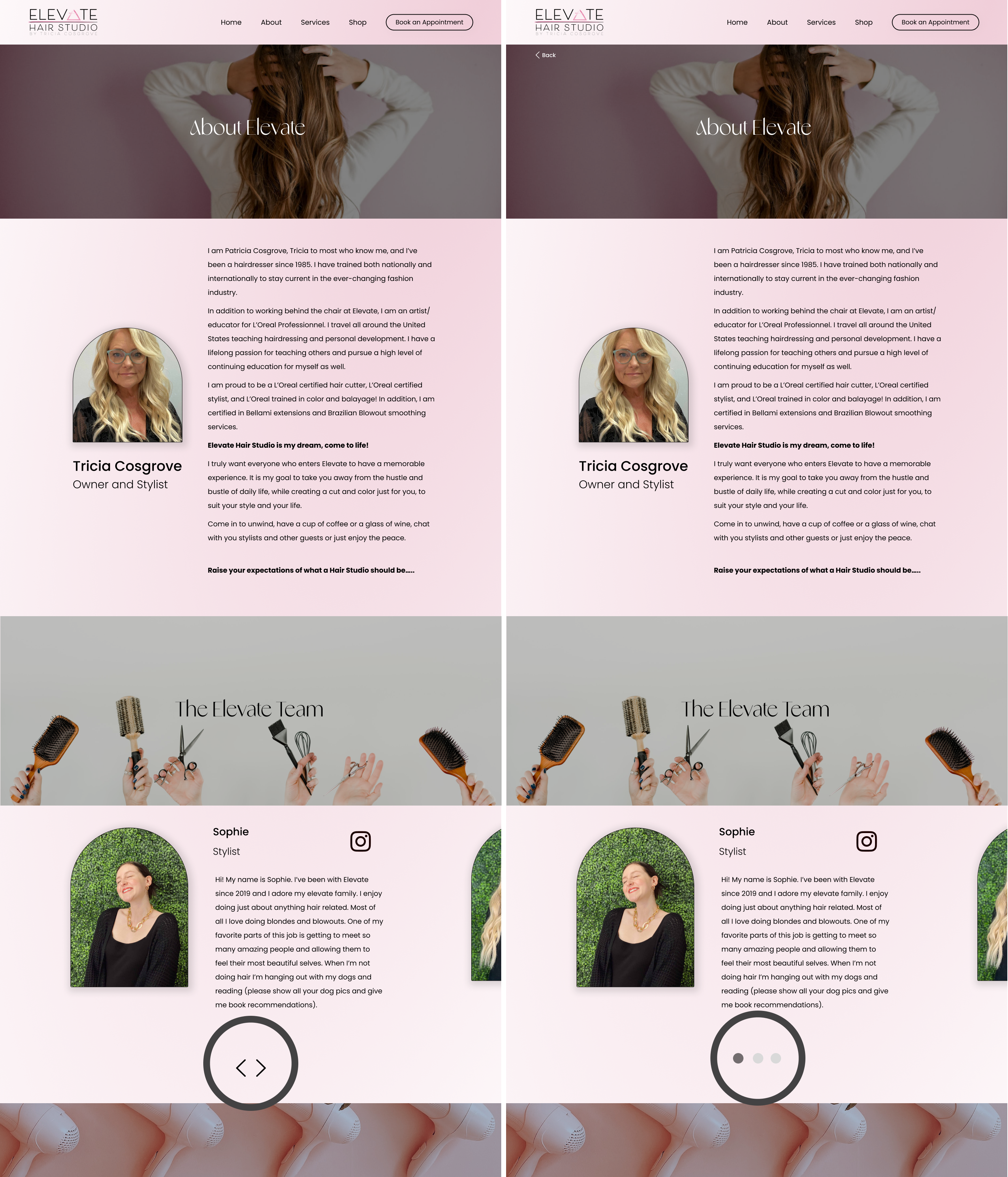
One user noted that there was no integrated back button, supposed this to be helpful
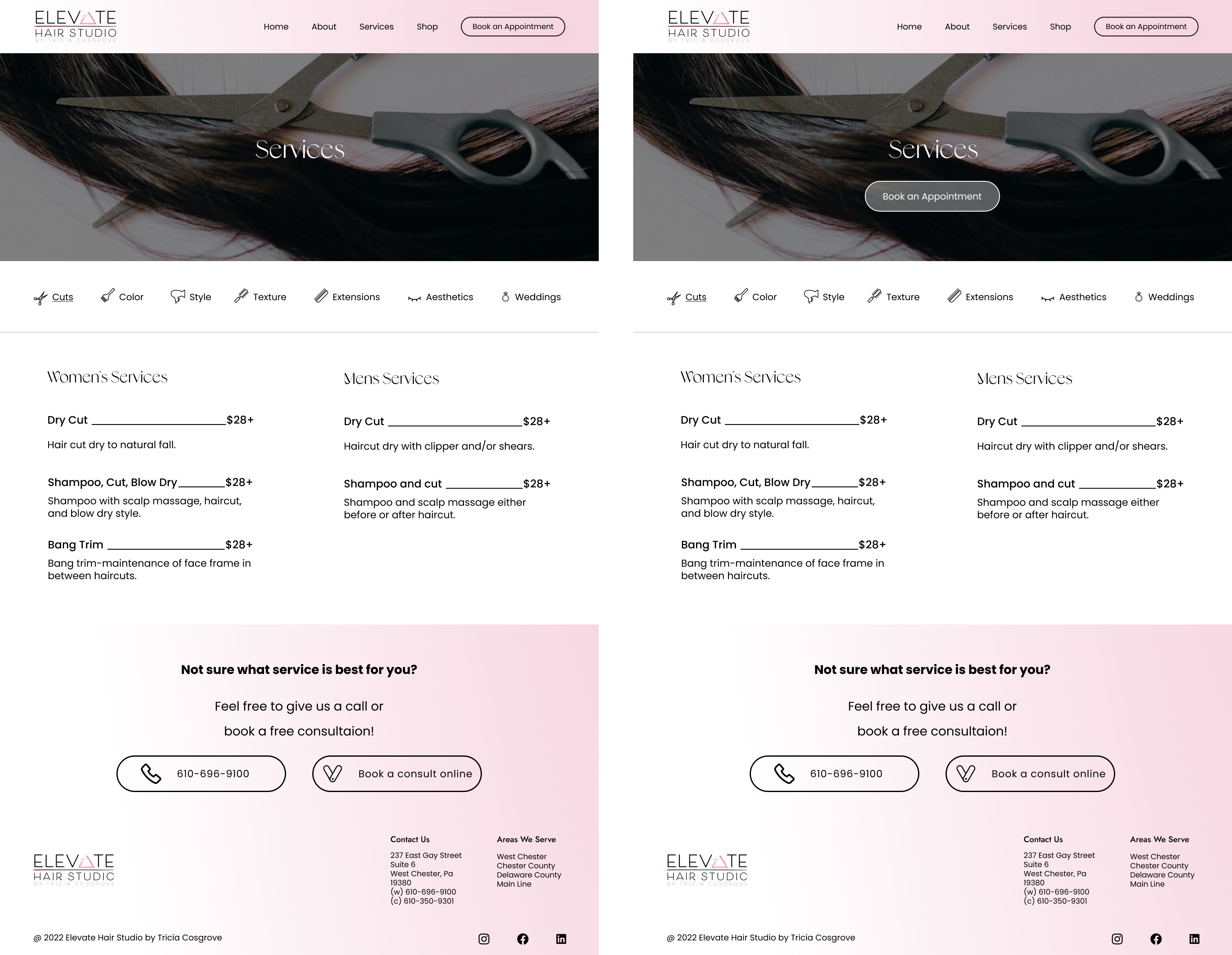
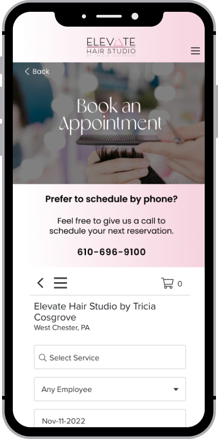
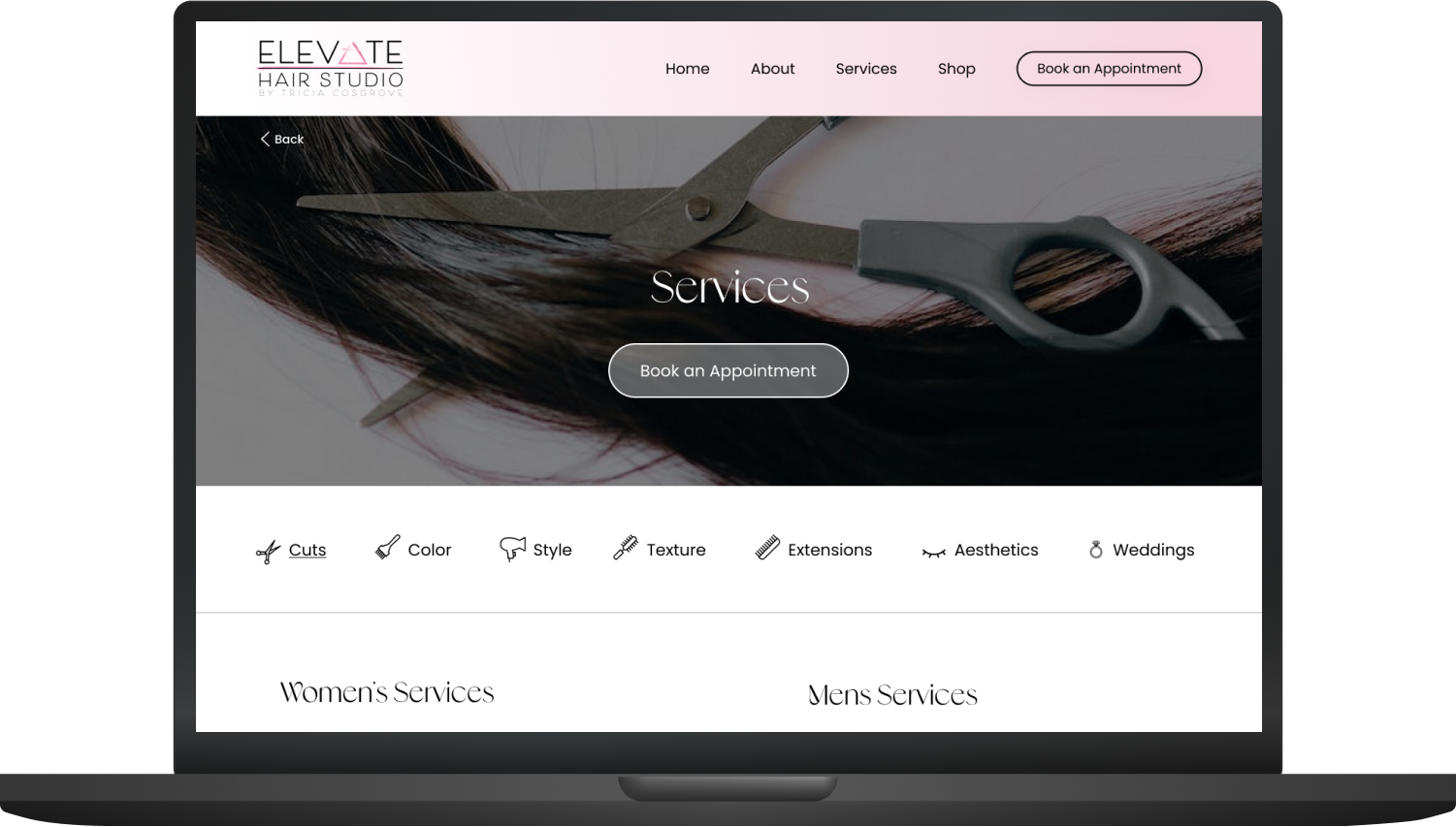
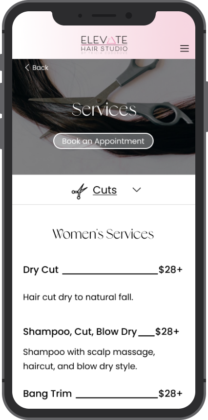
I noted that it may be easier to integrate a booking button on the services page for ease of access rather the user having to return to the menu
About page is too long, too much scrolling
Change arrows to sliders to indicate swiping
Determine how quickly users can complete a given task
Flow 1 - 8 seconds
Flow 2 - 28.25 seconds
Flow 2a - 50.25 seconds
Flow 3 - 23.25 seconds
*These numbers are the average of all 4 users.
Success Metrics & Results
Time to complete a task
Flow 1 - 8 seconds
Flow 2 - 28.25 seconds
Flow 2a - 50.25 seconds
Flow 3 - 23.25 seconds
Flow 1 (buy a gift card) was the quickest and easiest task to complete since it only involved 2 clicks. Flow 2 took the longest. One user had some confusion with the Instagram section on the home page and mistook that as the stylist section.
Comfort level when completing a task
While all users completed tasks fairly comfortably, they completed them differently. On both the desktop and mobile designs some users used the home page icons as their main navigation while others used the menu. Both features worked appropriately for each type of user.
Opinions on the overall experience
Overall, users had a neutral to positive experience. They were able to complete tasks quickly without too much confusion. The overall aesthetic was recieved very well and aside from minor critiques that will be addressed, the new design was well recieved.
Notes & Improvements
- Adding an integrated back button
- Changing navigation arrows to dots to better indicate swiping, especially on mobile
- Add a "book appointment" button to the services page for easier access to scheduling and create a smoother flow
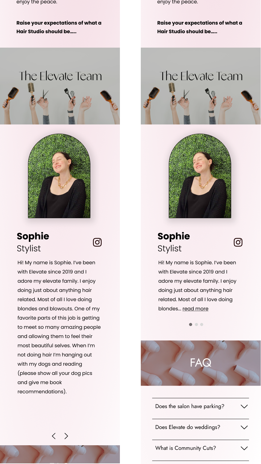
- Shorten stylist bios so the entire card can fit within the dimensions of a mobile screen
Iterations
Conclusion
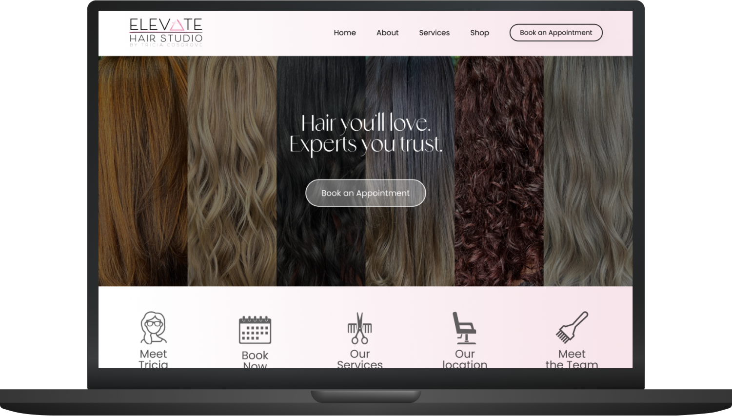
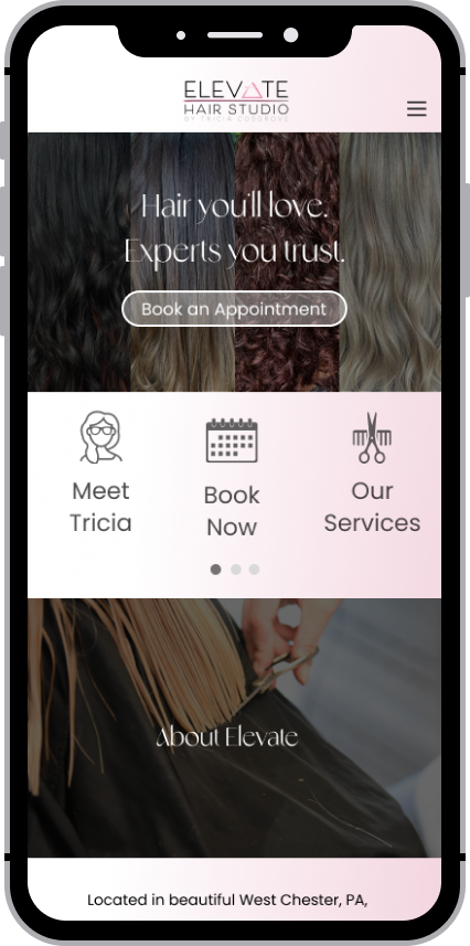
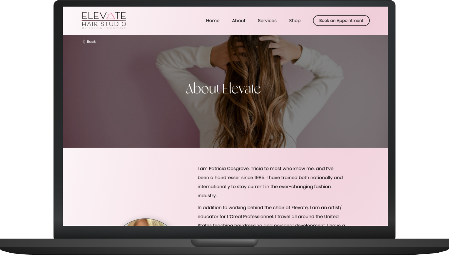
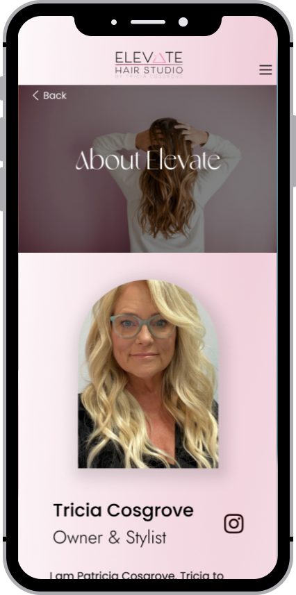
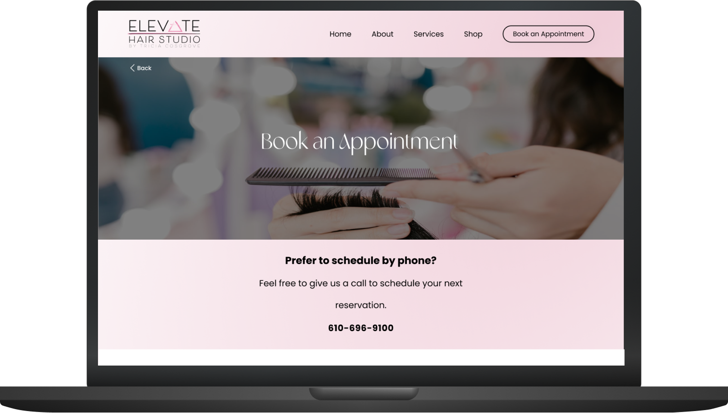
Elevate’s website has two main types of users, the new guest and the current guest. Both have different motives but similar goals. I was tasked to create the best website for both existing clients and new clients to use and that is what these final mockups represent. Users varying device preferences also made responsiveness a key design priority. Due to the split results of my user research and my personal design preference, I strayed from a mobile-first mindset and placed equal focus on both the desktop and mobile designs. This allowed me to ensure consistency.
The original website gave me a great framework to use as the base of my design. The owner wanted to keep the logo, the pink accents, and some icons but was open to a lot of the new ideas I offered. I was able to keep all the elements she loved from the original and help them shine through in the new design.
This project was completed in the span of 4 weeks and is in the process of being implemented on the current website. My goal was to create a web experience as pleasant as getting pampered at Elevate and I believe that has been accomplished through the redesign.
✦ let's connect ✦
Sophie Burt | 2023

