Product Objective: Adding a feature to an existing app
Role: UX/UI Designer
Date: 2022
Length: 4 weeks
Libby is an app that allows users to borrow ebooks, audiobooks, magazines, and more from their local library for free. It is a newer product by OverDrive and is used by millions worldwide. The app is featured in Apple’s App Store as well as the Google Play Store. You can read books across various devices including Amazon's Kindle. It gives users the ability to support their local library while enjoying books from their own devices. If your local library uses Libby, all you need is a free library card and you can sign up in a few quick steps. Using the results of industry research and user interviews, I have created and designed a feature that will seamlessly fit into Libby’s Current UI and benefit Libby as a company, local libraries that use Libby, and Libby users alike.
Metrics Insight
150% Increase in time of engagement
75% Increase in app interest by new Libby users
75% Decrease in user error rate post testing iterations
Background
The Problem:
While reading can be a quiet and personal activity, it is increasingly becoming a social act. Due to its resurgence in popularity thanks to social media platforms like Instagram and Tik Tok, people are using books as a means to connect. This is what Libby is lacking. Though Libby has made acquiring ebooks and audiobooks easy and accessible, the app has offered no way of connecting readers with each other and provides limited means for them to connect with their local communities and the libraries that support them.
The Solution:
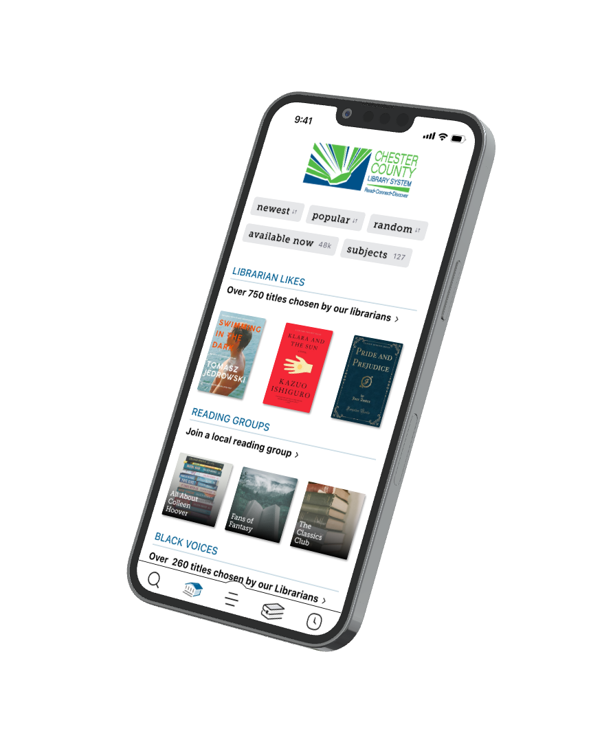
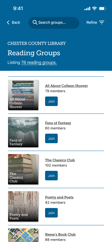
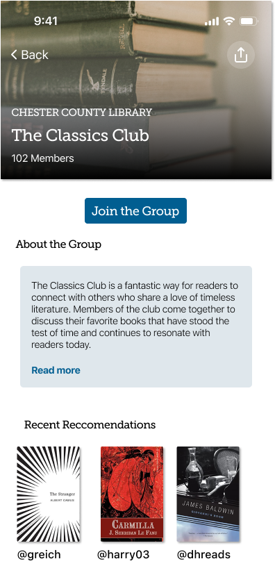
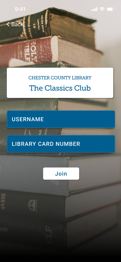
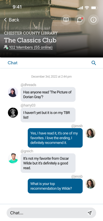
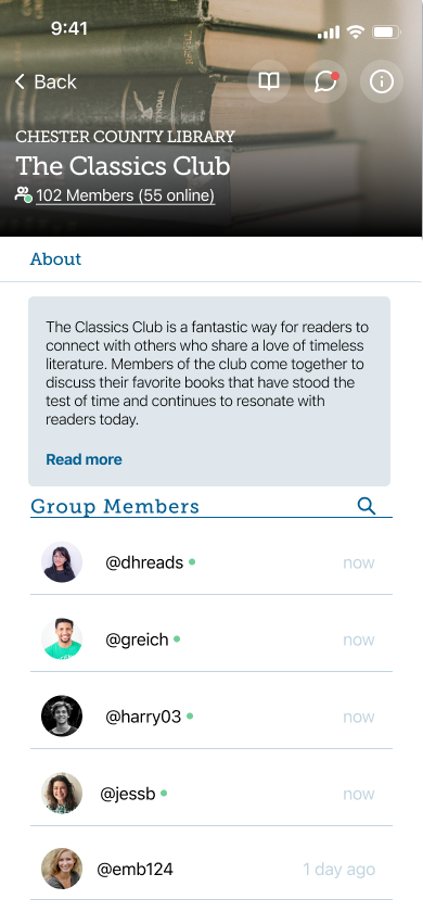
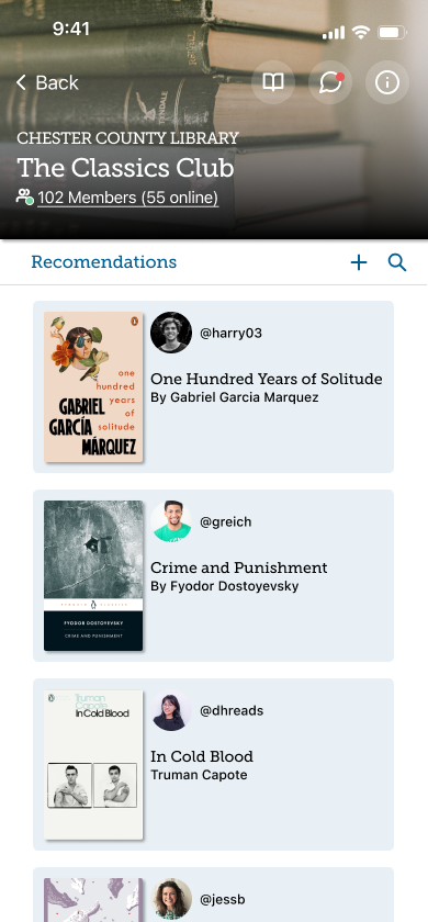
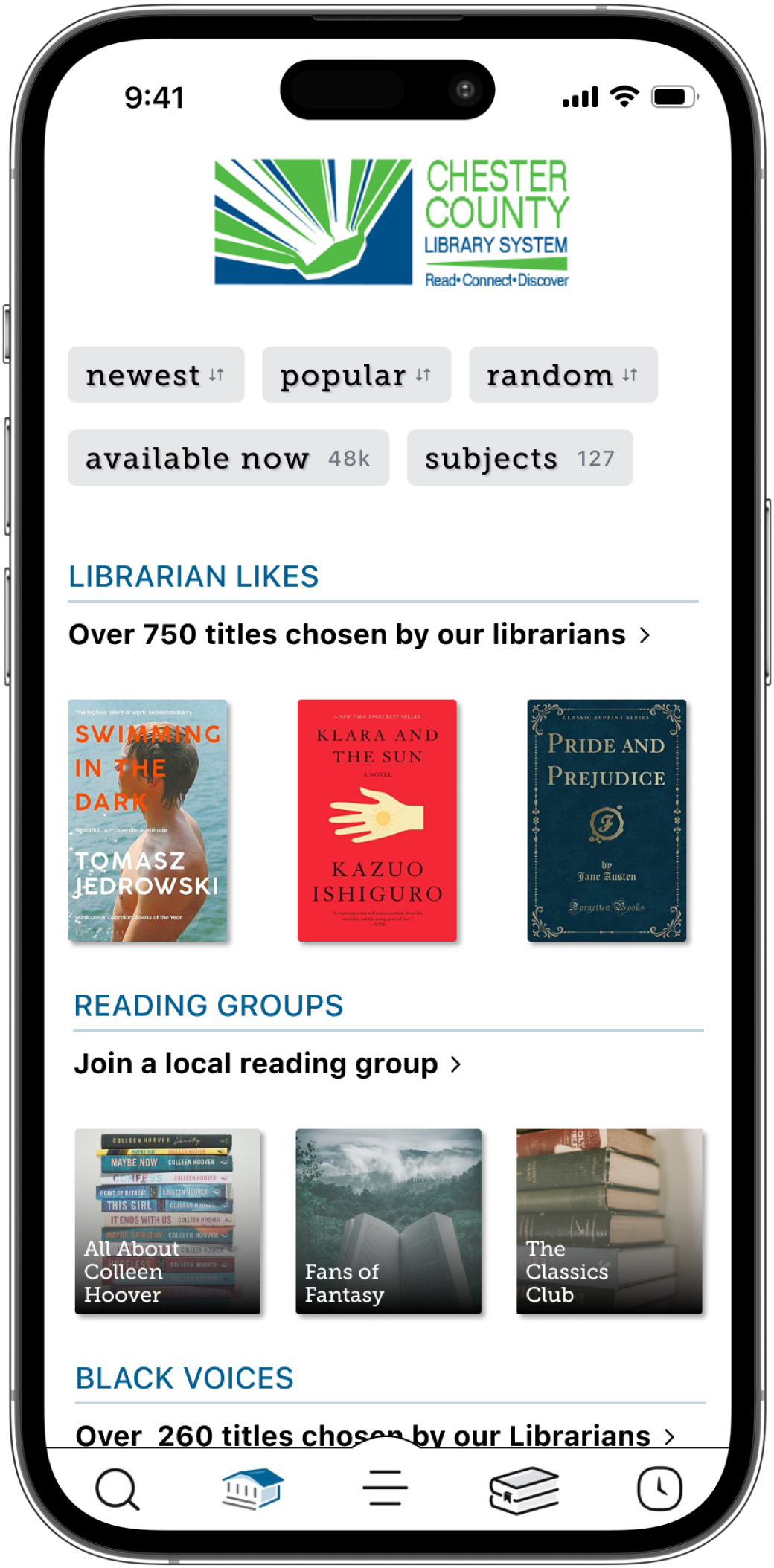
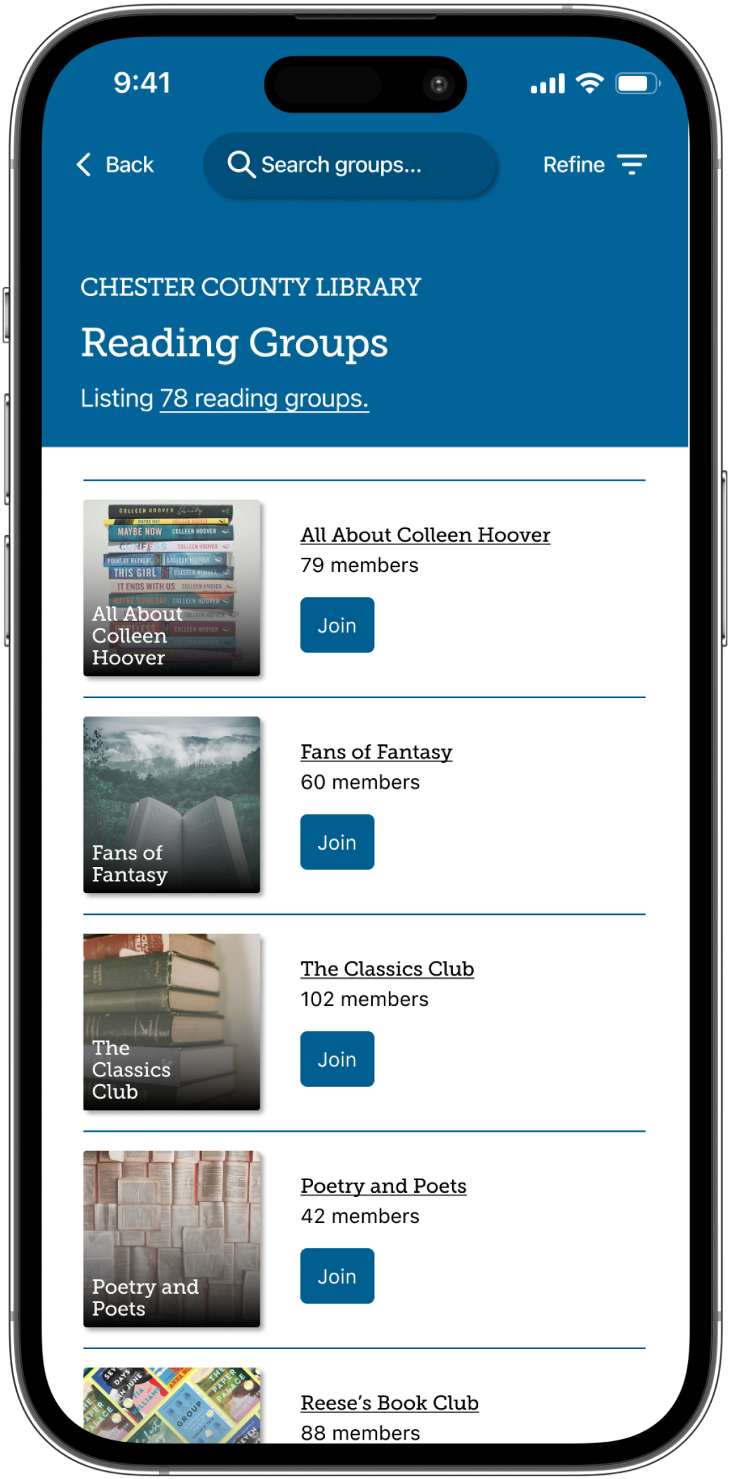
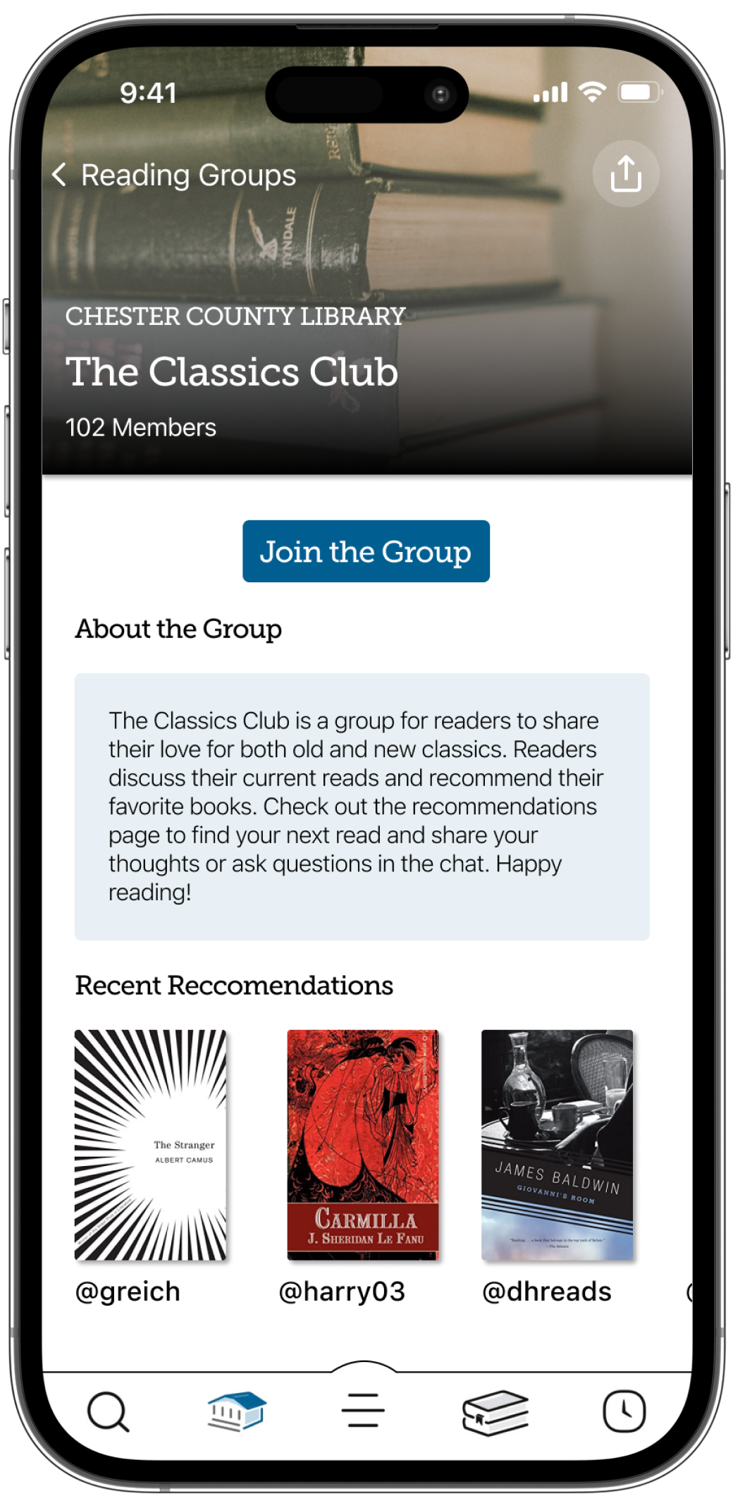
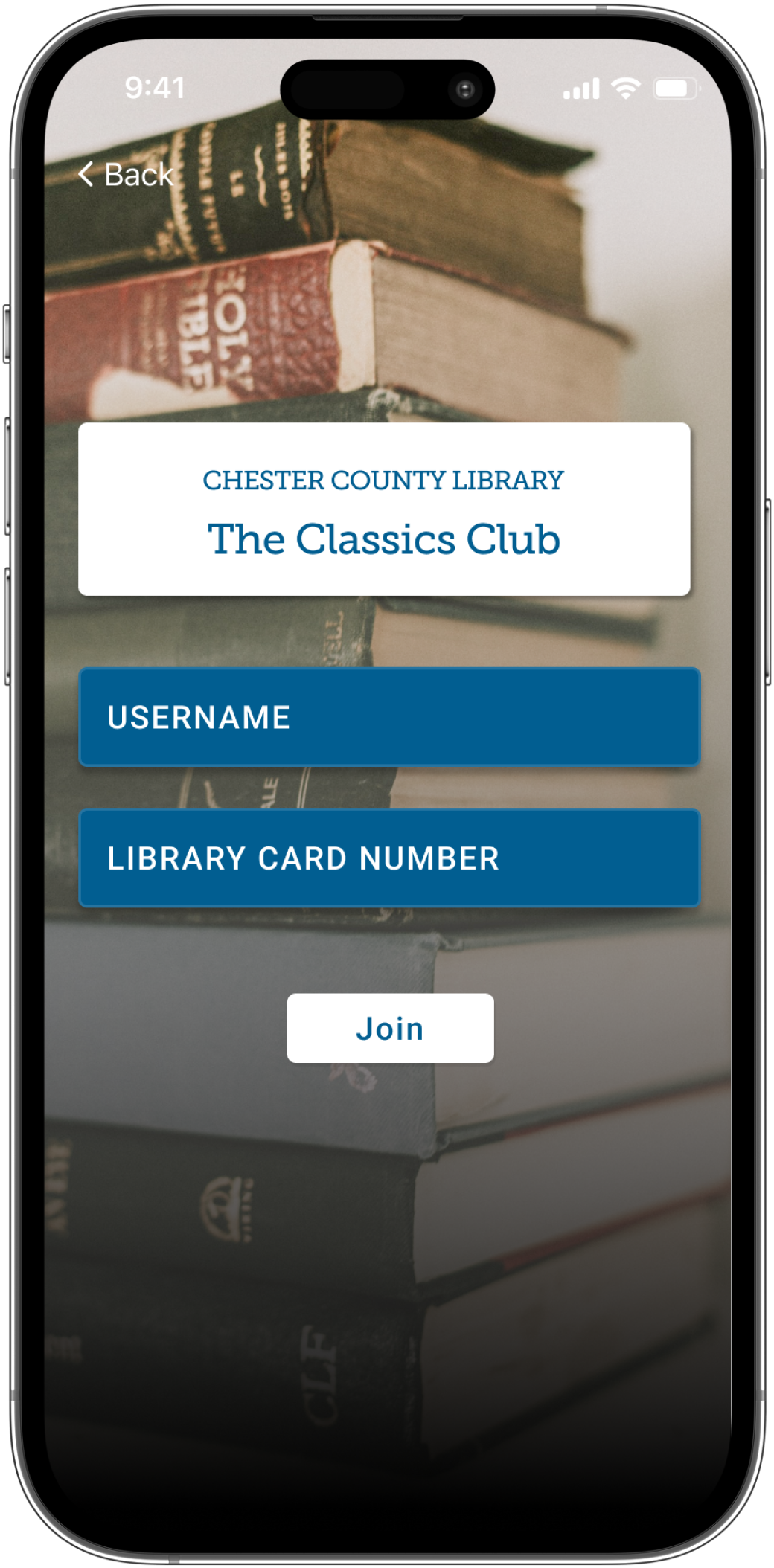
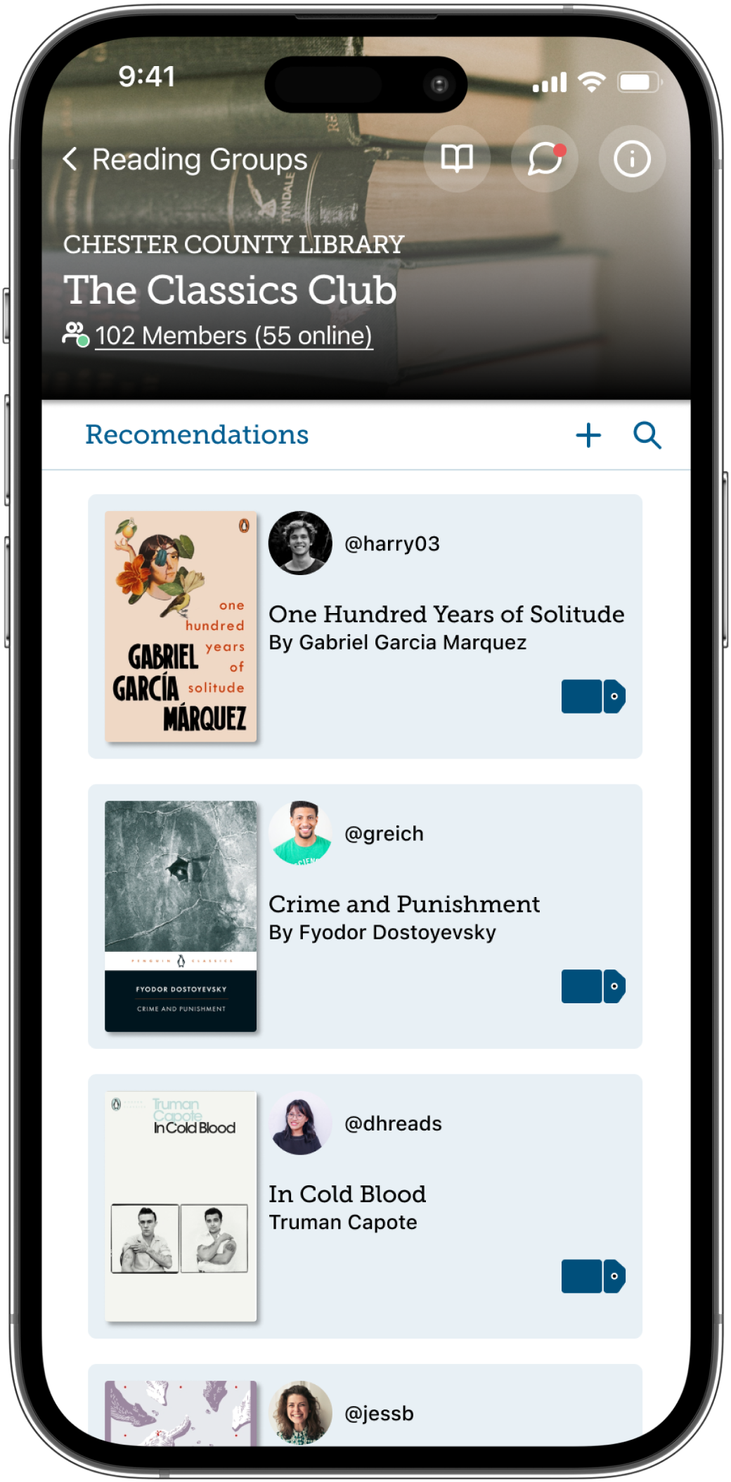
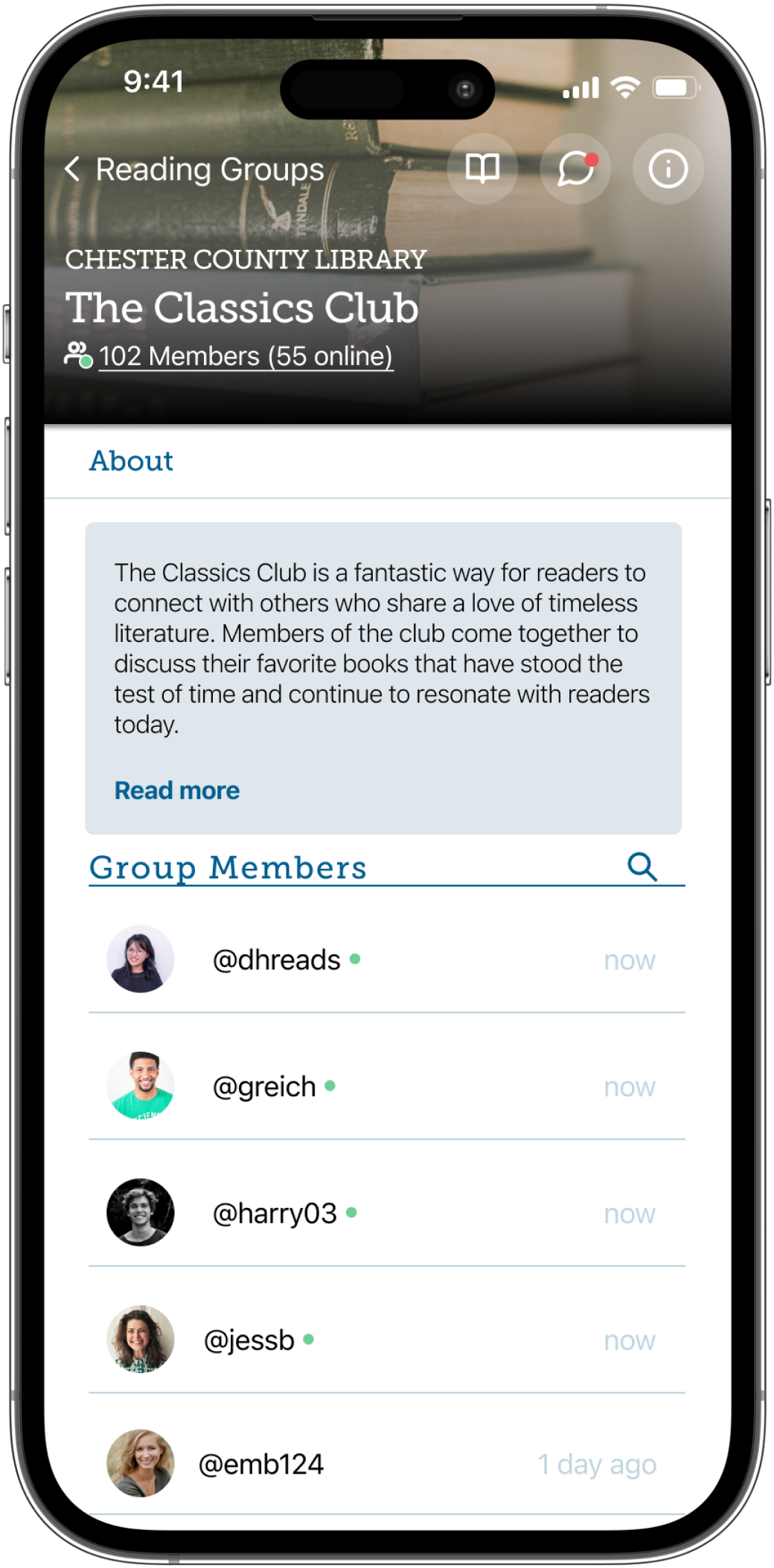
I propose adding a feature to Libby called "Reading Groups." These virtual groups can be accessed through a user's local library interface on the Libby app. Users will be able to join a variety of niche groups where they can provide and receive recommendations and discuss these books in a chat with other users. These groups will be proctored and supported by the individual libraries thus connecting users back to their communities and fellow local readers. This feature will also incentivize users to use the app more often and to stay on it longer.
Empathize and Define
Industry & Comparative Research:
The pandemic has shown an increase in e-book reading since libraries had to close their doors due to the Covid-19 pandemic.
[In 2020] "More than a hundred library systems checked out a million or more books each from OverDrive’s catalog, and the company reported a staggering four hundred and thirty million checkouts, up a third from the year before.”
There are five widely used ebook vendors - Overdrive's Libby, Bibliotheca, Hoopla, Axis 360, and the nonprofit Digital Public Library of America - of all of these Libby is the largest and most popular.
User Interviews: Top Findings
Interviewees consisted of 4 avid readers
All interviews were conducted virtually over Zoom.
All users spent 1-3 hours per day on social media apps and 0-38 minutes per day on reading apps.
The users that spent the most time on reading apps, read more audiobooks/ebooks while users who spent less time on reading apps, preferred physical books.
While users considered the act of reading a solitary experience, all users confirmed that they enjoy talking about and sharing books with their friends, family, coworkers, etc.
User Personas
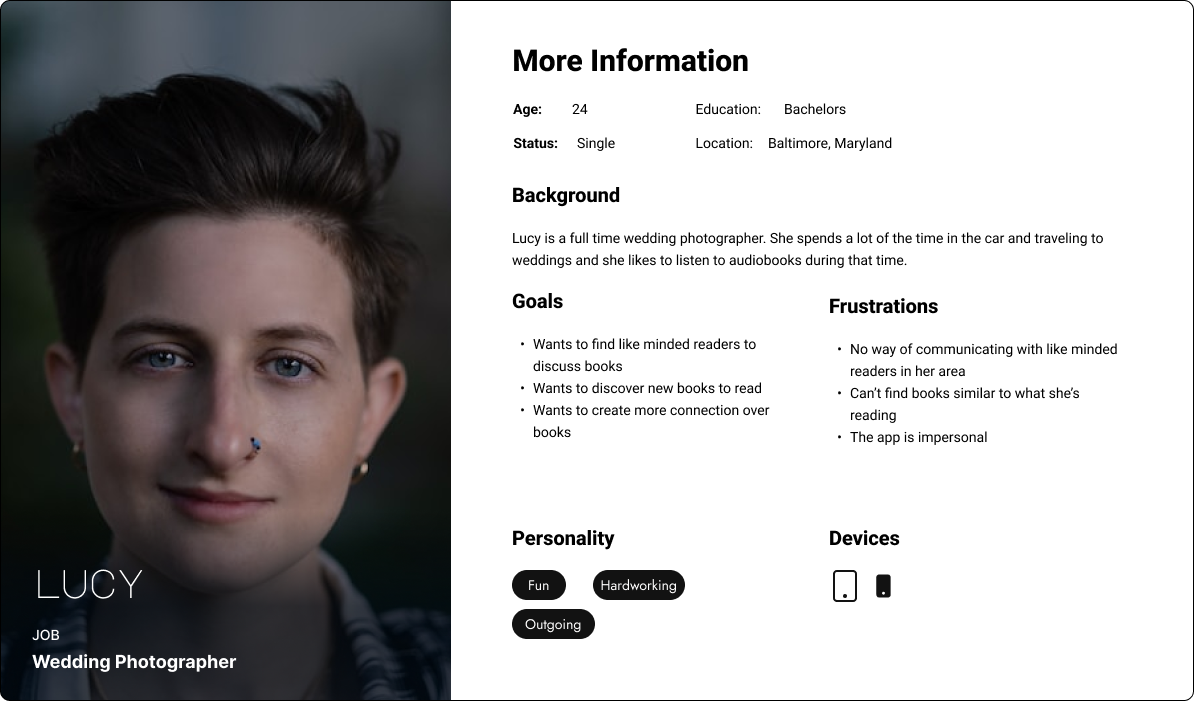
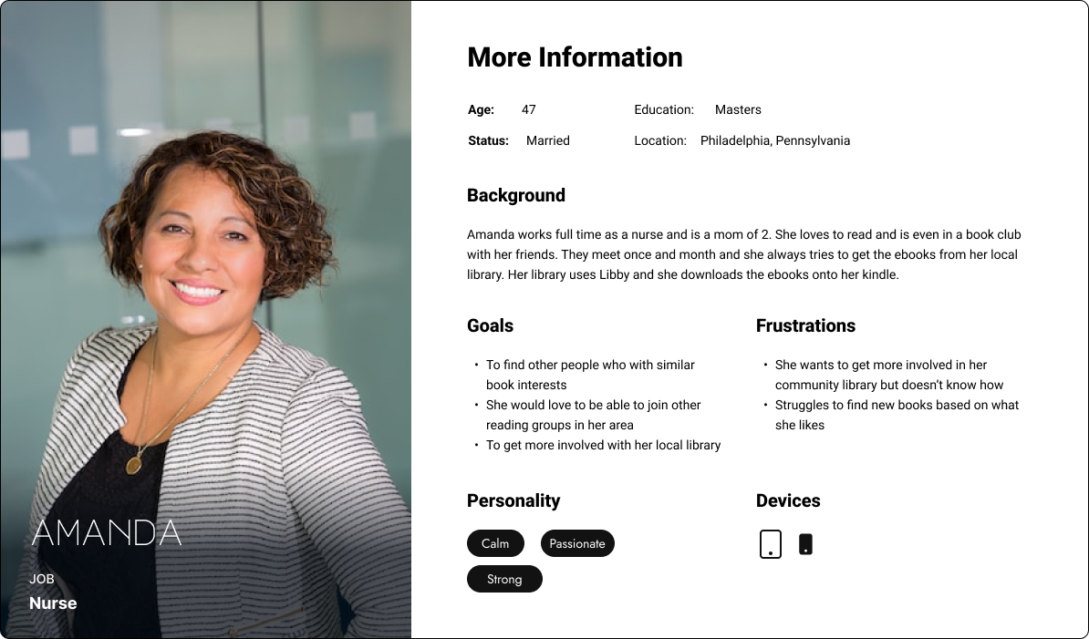
Using the data from user interviews, I developed user personas of current and potential Libby users. These personas pinpoint users' main goals and what they would like to see change.
Research Results
From my research and interview results, I believe there is a place in the digital library industry and within the Libby app to provide users with an easy way to connect with each other and their communities. Creating a more personal and inviting space will help local libraries increase the number of patrons and get these patrons more involved in the community. The popularity of apps like Good Reads shows us that users want to connect over books. It would be beneficial for Libby to provide users with the option for socialization within the app lessening the chances of them seeking it else. This will also drive more users to Libby and encourage users to spend more time on the app since they will be more emotionally invested.
Ideate & Prototype
Task Flows
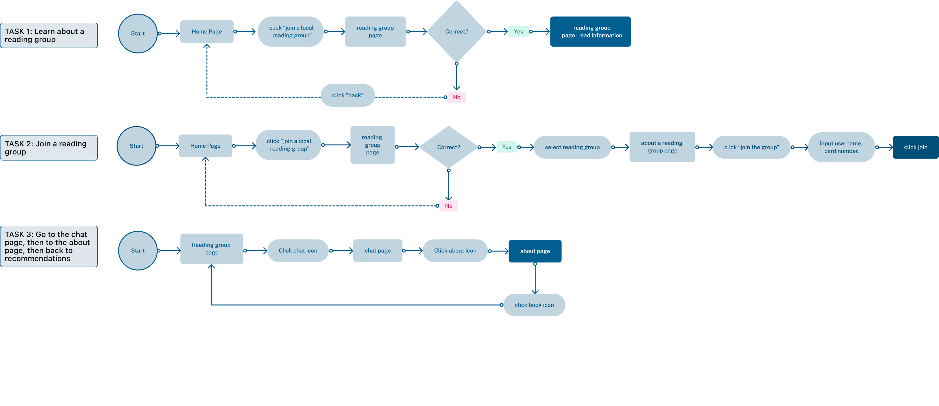
These 3 task flows represent 3 flows a user may go through while using Libby's Reading Groups.
Low Fidelity Wireframes
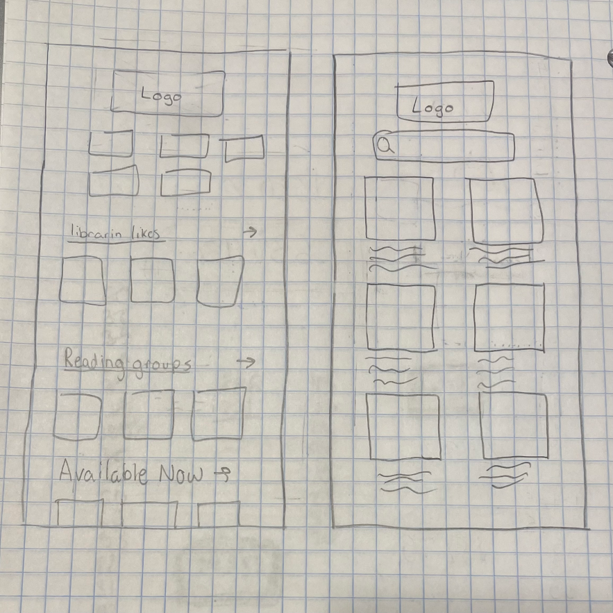
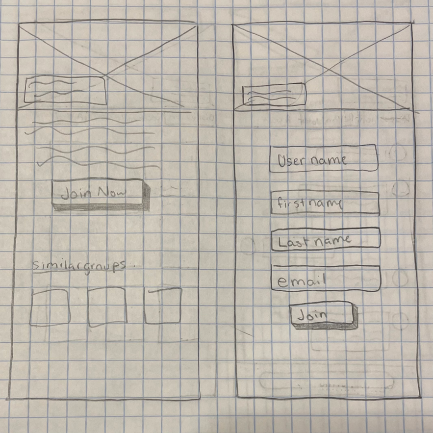
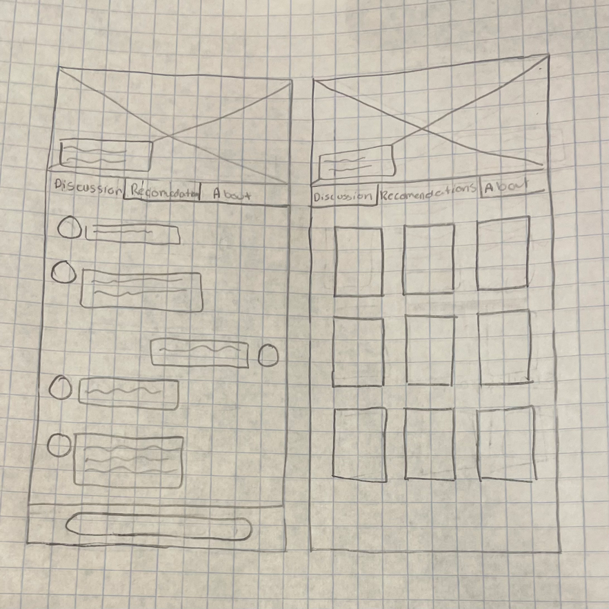
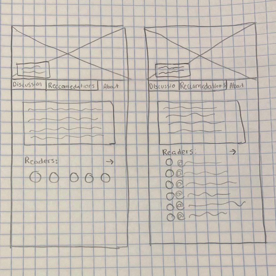
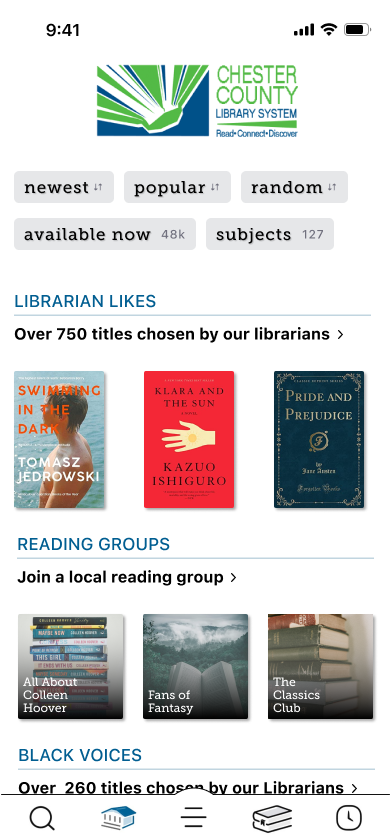
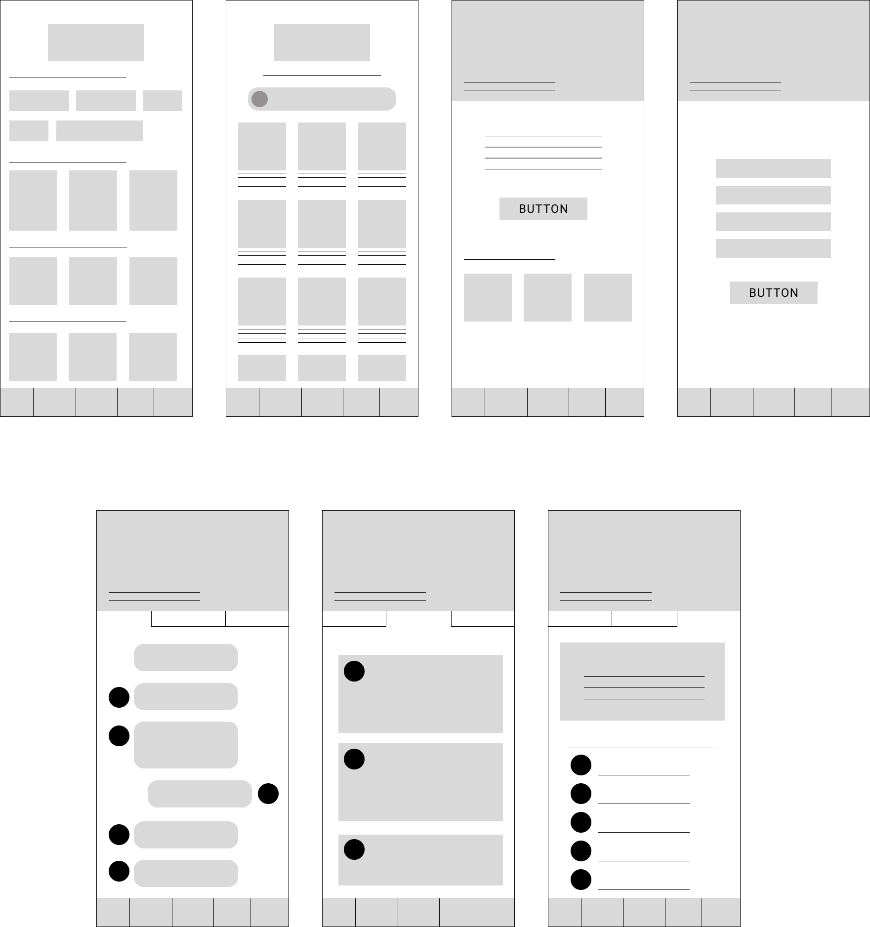
Following the sketches are the low-fidelity wireframes for the home library screen, reading group list, about reading group screen, chat page, recommendation page, and about page within the group.
Style Guide
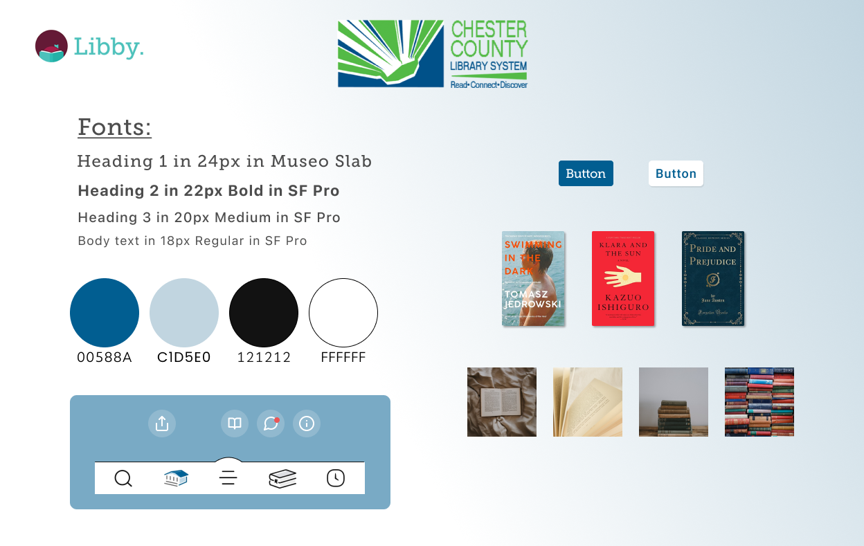
Libby does style a little differently. While their brand colors are teal, purple, and pink, the color scheme of the interface depends on the library that is being used. The colors of the Libby interface change between libraries and they are based on the library's logo and preferred colors. I based my designs on the Chester Country Library System. The fonts used are Museo Slab and San Francisco Pro. Font styles stay consistent no matter the library being used. The styles of shadowing and icon aesthetic were kept streamlined to maintain cohesiveness between the app and the additional feature.
High Fidelity Wireframes
Test & Iterate
Usability Testing
Tested 3 different task flows with 4 users.
Flow 1:
Learn about a reading group
Flow 2:
Join a reading group
Flow 3:
Go to the reading group chat, then to the about page, then back to the recommendations
Research Goals & Results
Determine ease of use
Flow 1 (learn about a reading group) was unanimously the easiest flow
Users noted that the screens were simple to use
The only errors noted were those related to the prototype and not to the designs themselves
Determine Memorability
Users were able to move through Flow 2 quickly and easily after moving through the first half of the task in Flow 1
Memorability sped up task completion
Determine any points of common error or confusion.
Readability issues with the back button
The general confusion about back buttons
A user asked if there was a way to save recommended book because the design has no integrated save or tag button
Determine how quickly users can complete a given task
Flow 1 - 8.25 seconds
Flow 2 - 23.25 seconds
Flow 3 - 19.75 seconds
*These numbers are the average of all 4 users.
Success Metrics & Results
Goal:
Result:
Increase User time on App
Attract new Users
Low Error Rate During Use
With the data and metrics collected, users will spend an estimated 150% more time engaging within Libby than they did before the addition of the Reading Groups feature
75% of new users noted a higher interest in the app after utilizing the Reading Groups feature.
After initial iterations were made, error rates decreased by 75%.
Notes & Improvements
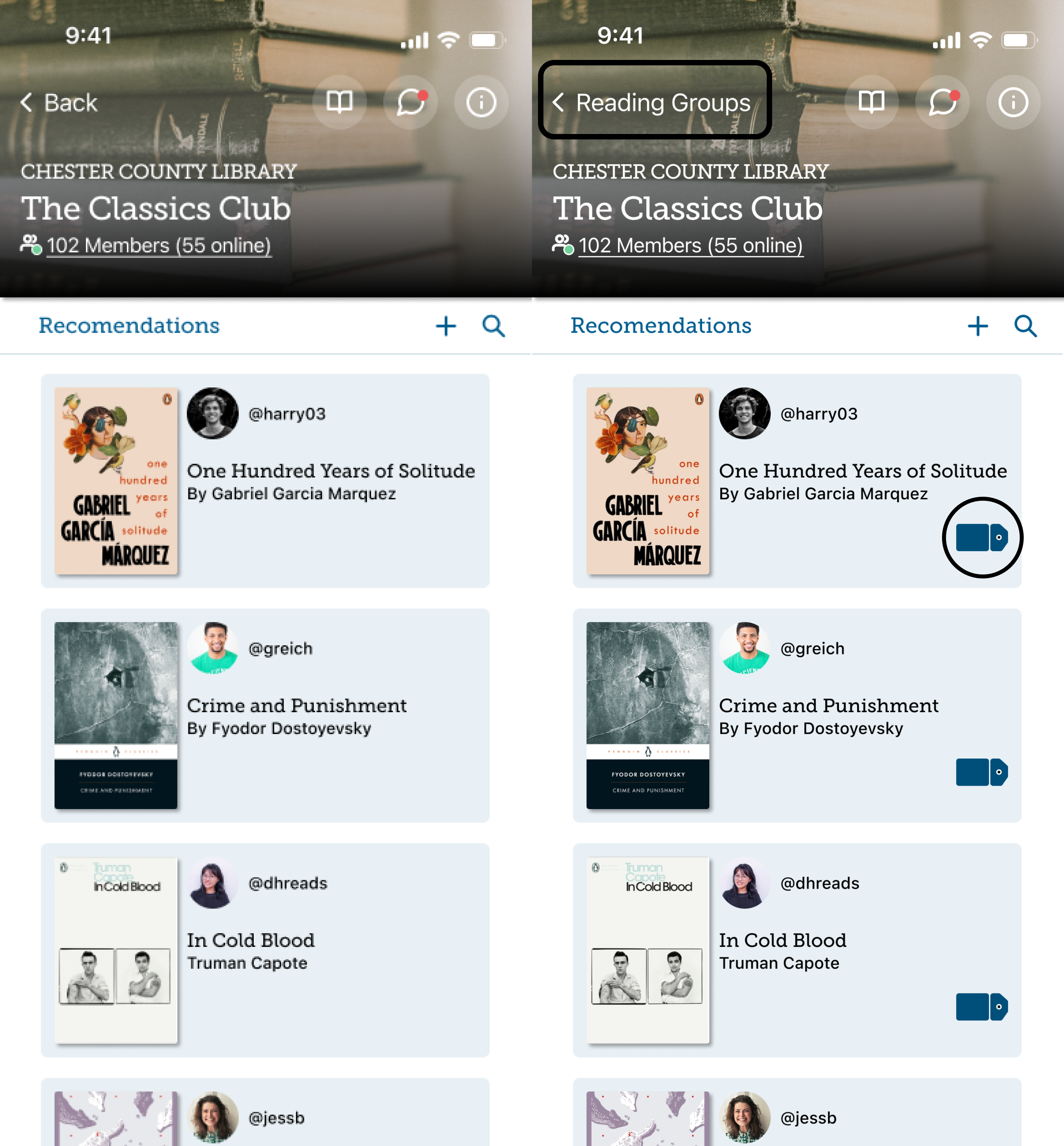
- Adding a tag to recommendation cards on the group home screen - This will allow users to tag books into a folder to save or rent later. The "tags" feature is an existing feature within the Libby app it is used to save books into sorted folders for later. After adjusting it slightly, I added the same icon to the recommendation cards.
- Changing the back button text to "reading groups" and having it only go back to reading groups - Since the reading group navigation is simple and easy to use, the back button is only necessary when needing to exit the group.
- Minor cosmetic changes (addressing any readability issues, over/underlays, balance, etc.)
Final Designs

Conclusion
This project brought to my attention the importance of design consistency and not overstepping my role as a designer. Sometimes we are tasked to create something brand new, sometimes we must change a design entirely, and other times we are tasked to add to an existing product. This case study was the perfect lesson in adding instead of changing. I kept having to regroup and take note of my role as a designer in this project and get comfortable with adding to the current UI and not reworking the UI that already exists. I was able to do this by frequently reverting back to my problem and solution statements to remind myself of the task at hand and visiting the original app to ensure I’m maintaining a cohesive design.
The next steps for Libby reading groups will be to facilitate further user testing involving more detailed actions such as recommending a book or posting in the chat.
✦ let's connect ✦
Sophie Burt | 2023

