Product: End to End App Concept and Design
Role: App creator, UX/UI Designer
Date: Dec 2022 - Feb 2023
Length: 6 weeks
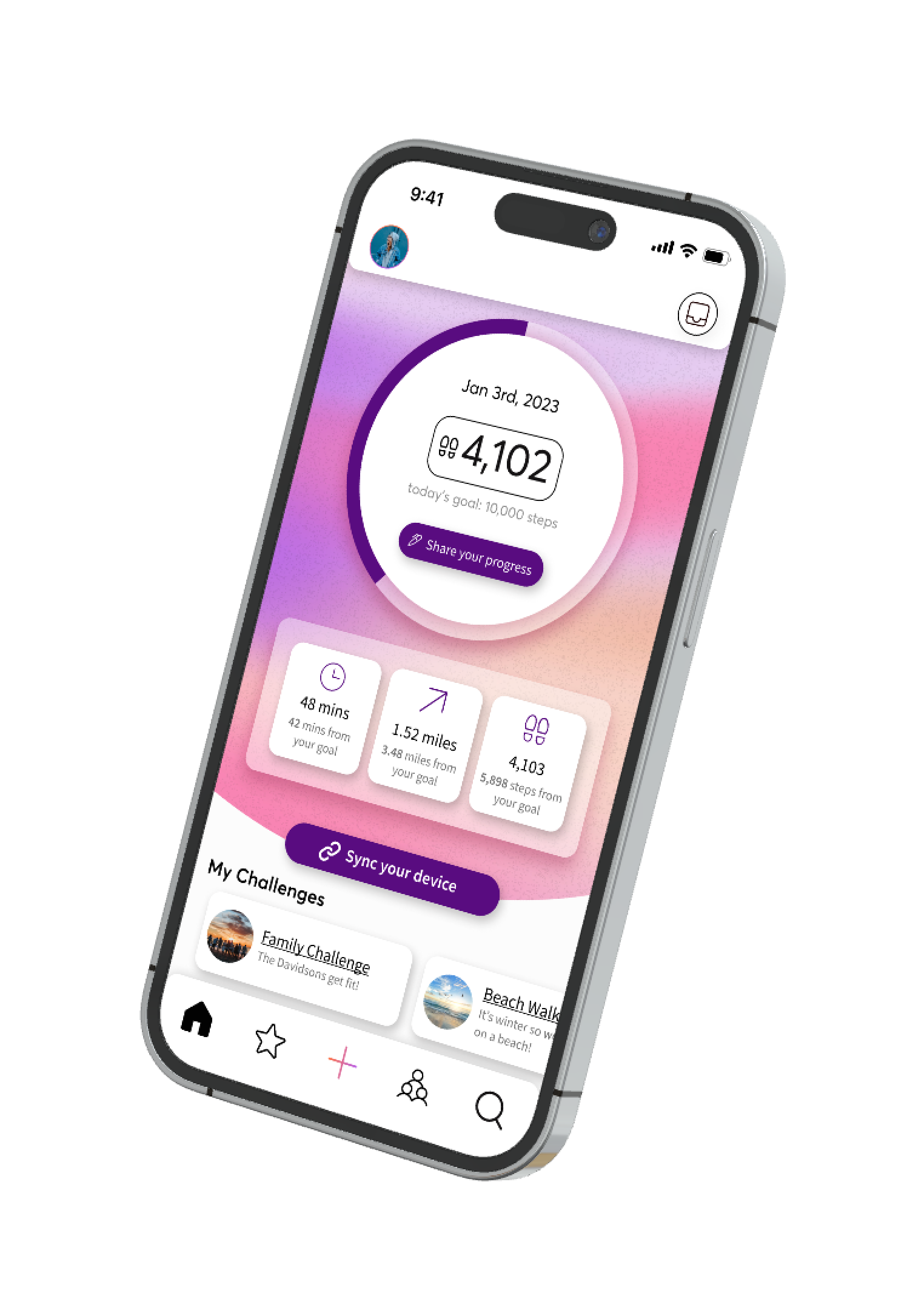
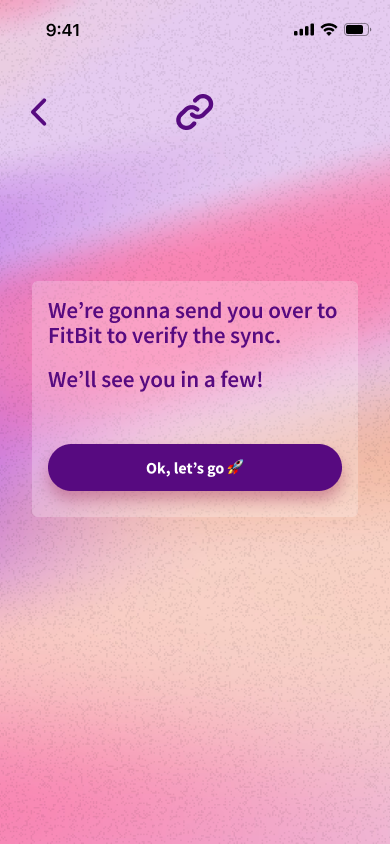
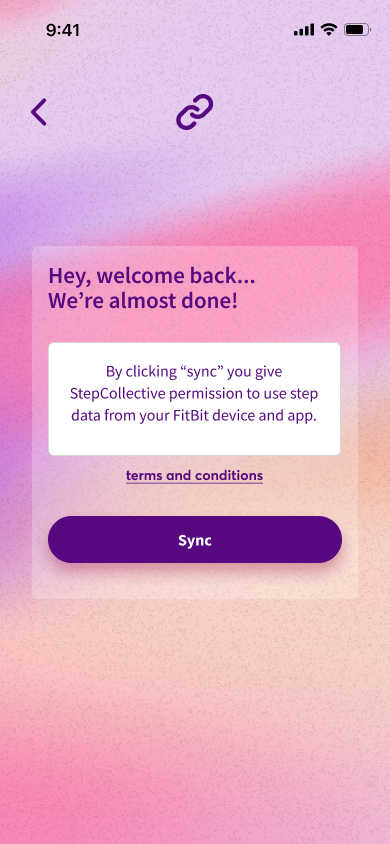
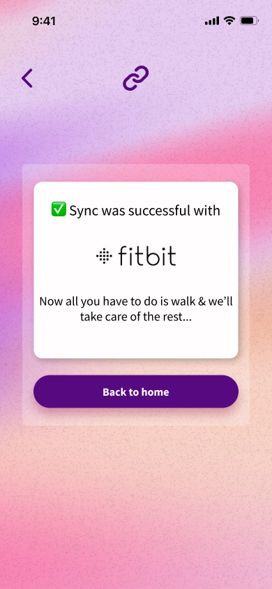
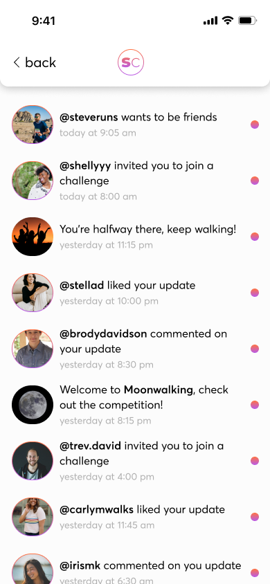
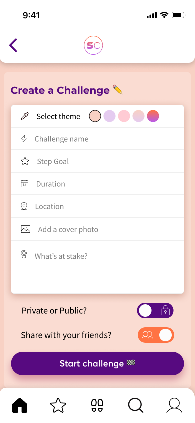
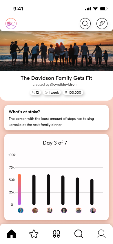
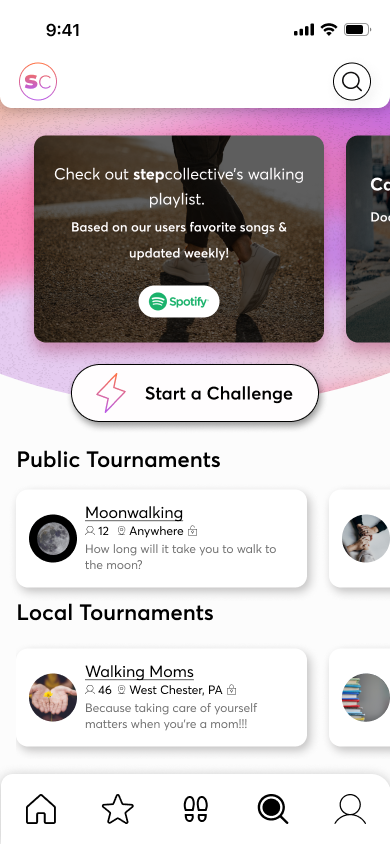
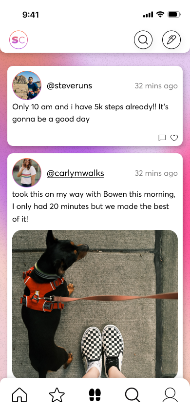
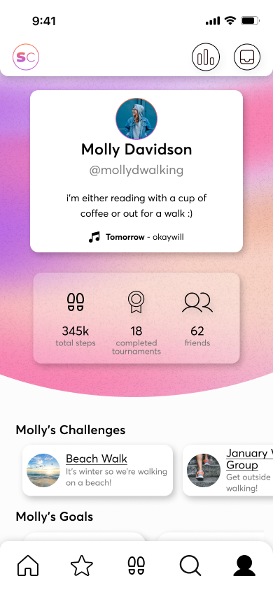
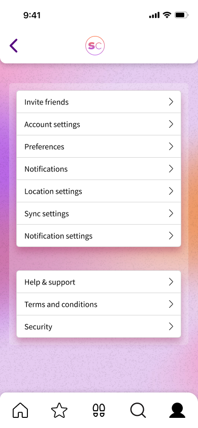
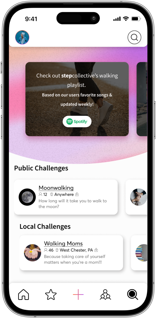
StepCollective is an app that enables users to connect their wellness watch data to a centralized app, allowing them to compete and challenge friends regardless of their fitness tracker. The app accommodates users without fitness devices to track steps and compete. Users can create and participate in public or private challenges, with the ability to bet and choose stakes for the winner or loser. The app promotes a non-judgmental and fun community of individuals who prioritize movement accessibility.
Metrics Insight
120% Increase in time of engagement
100% Increase in app interest by socially focused users
86% Decrease in user error rate post testing iterations
Background
Using the results of industry research and user interviews, I have created and designed an app that will allow users to engage in movement support and competition with each other regardless of the fitness tracker they use.
The Problem:
Users who have fitness tracking devices cannot connect with others unless they have the same fitness device. This limits opportunities to support one another and achieve their fitness goals.
The Solution:
Providing users with a platform that allows them to connect and reach fitness goals uninhibited by technology.
Empathize and Define
Industry & Comparative Research:
Step tracking has several advantages as a metric for assessing physical activity - it is intuitive, easy to measure, objective, and it represents a fundamental unit of human ambulatory activity.
Walking and running are great activities for all types of people despite factors such as age and physical fitness. Not everyone has to time, ability, or desire to partake in high-intensity workouts. Walking and step tracking can be a great way to be more conscious about your daily movement and can help inspire people to take charge of their lifestyle and health.
Working out can sometimes be a lonely activity, people do better and are more likely to reach their desired results when they feel supported and connected to other people with similar goals.
User Interviews: Top Findings
Interviewees consited of 5 potential users
All interviews were conducted virtually over Zoom.
All 5 interviewers have a FitBit or Apple Watch that they user daily or weekly.
The Apple Watch users were less likely to use the step challenge feature due to a lack of interest from them and their social group.
All of the Fitbit users, utilized step challenges almost weekly. For one user it was one of the main reasons they purchased their Fitbit.
User Personas
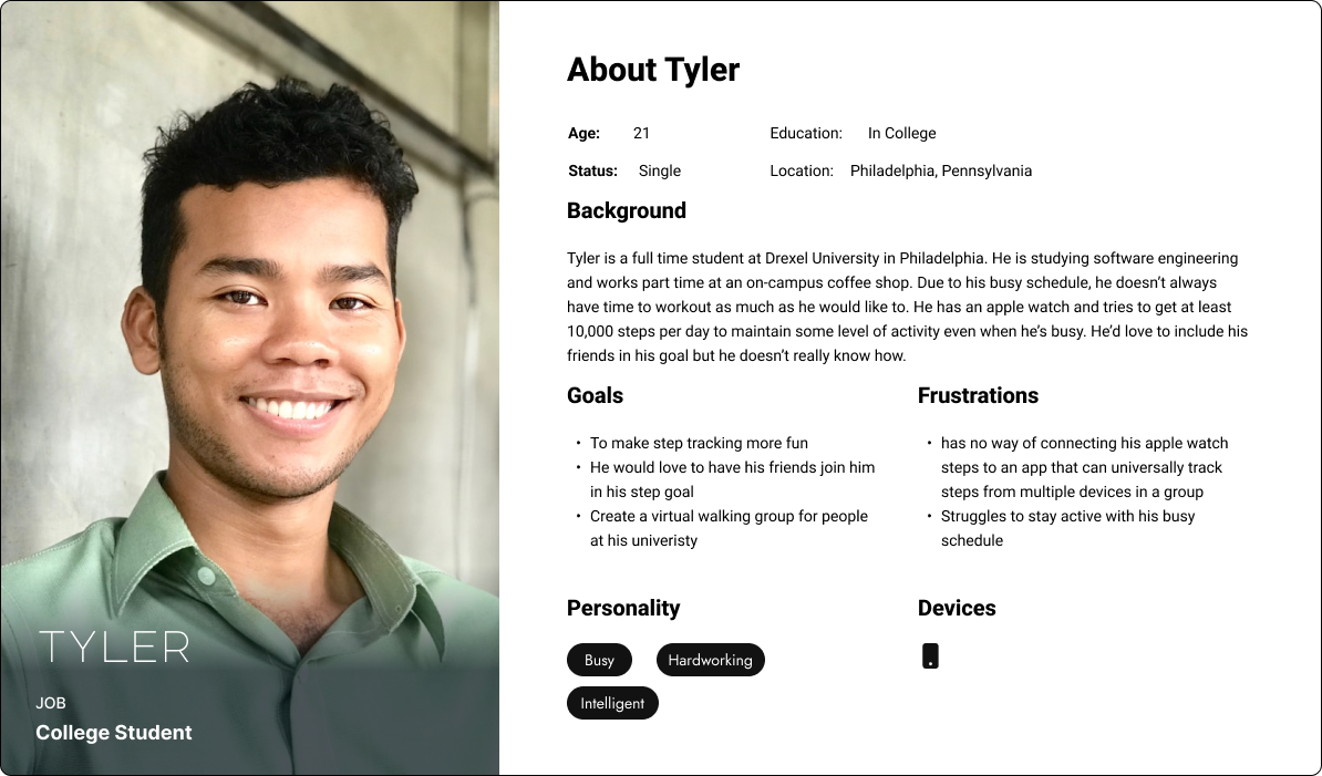
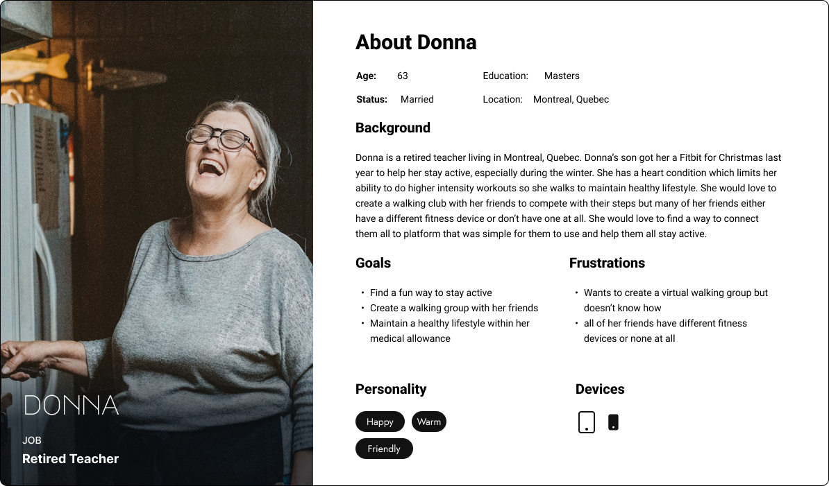
Using the data from the user interviews I developed user personas of current and potential Libby users. These personas pinpoint users main goals and what they would like to see in a new app.
Research Results
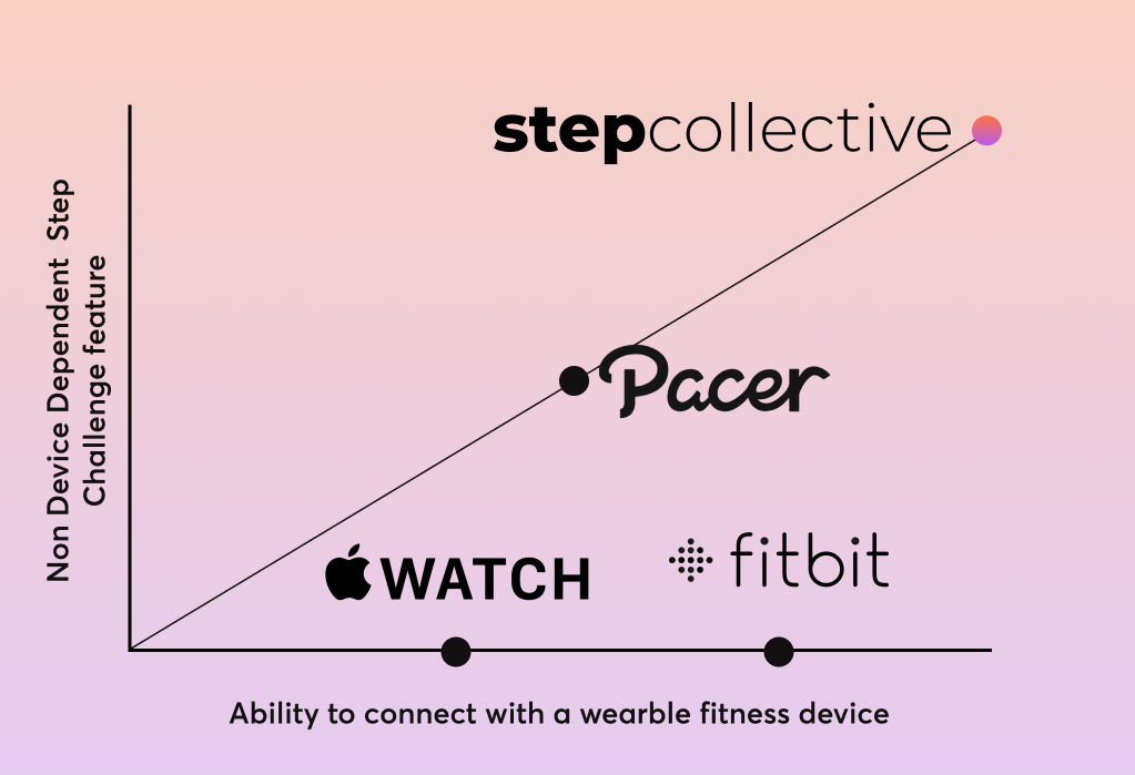
Step Collective’s biggest competitors are the apps associated with fitness watches like the FitBit and Apple Watch. There is also an app called Pacer that has a similar feature to Step Collective where you can create challenges with your friends and join large group challenges. What sets Step Collective apart is the ability to use your collected data via a fitness device (such as a Fitbit) and sync it to your Step Collective App. Pacer does allow Fitbit to connect to the app for a fee and it does not allow any other connectivity options. FitBit and Apple both have apps that feature step challenges but you can only do it with users who have the device/app, which can be limiting for users. Step Collective provides the connective features of devices like the Apple Watch or FitBit with the challenging abilities of an app like Pacer to create a universal, community-based step-tracking experience.
Ideate & Prototype
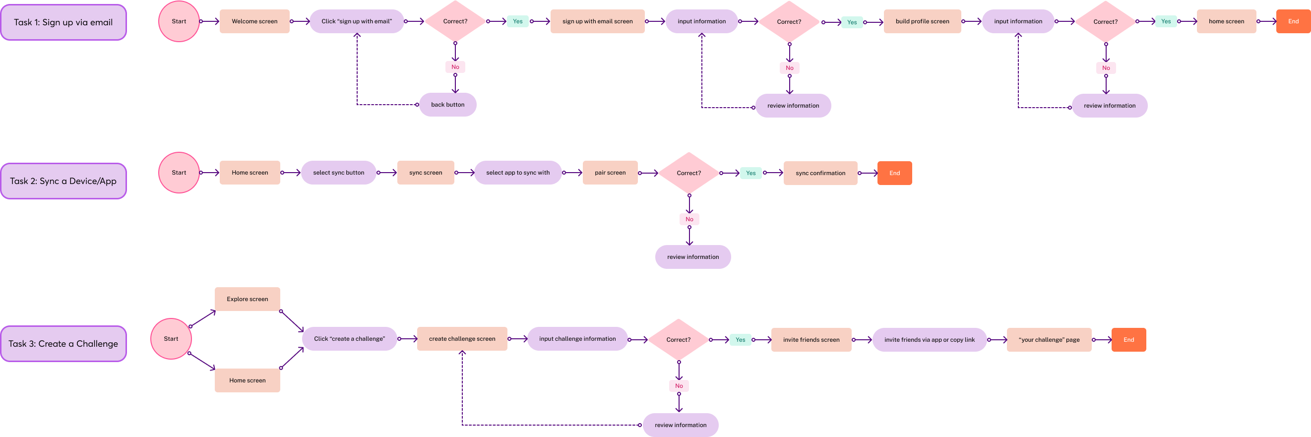
Task Flows
These 3 task flows represent steps and actions a user may go through while using StepCollective.
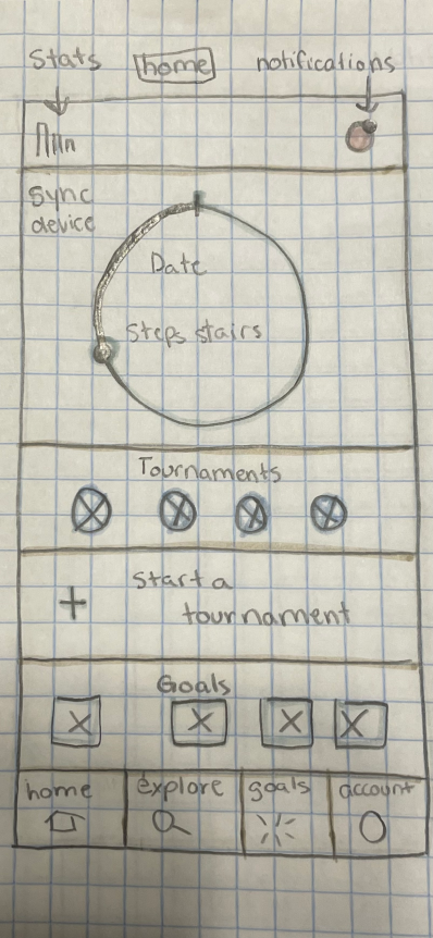
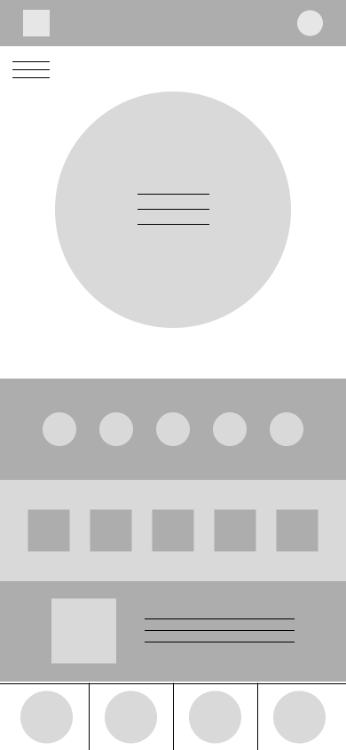
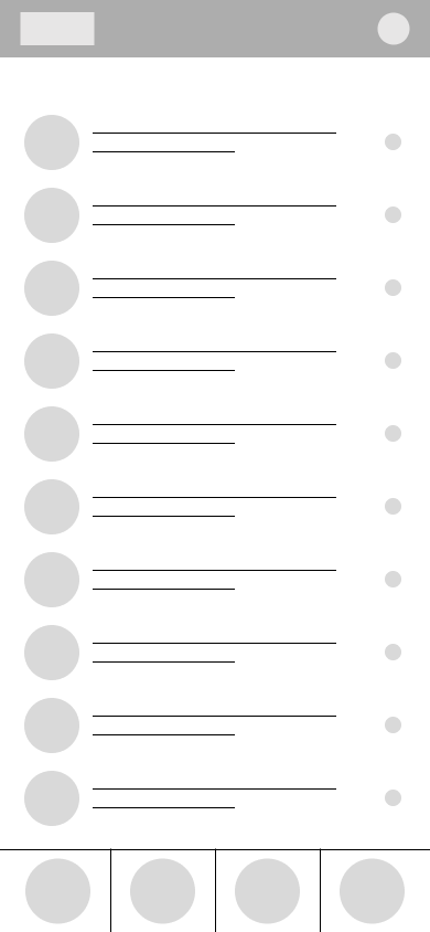
Low Fidelity Wireframes
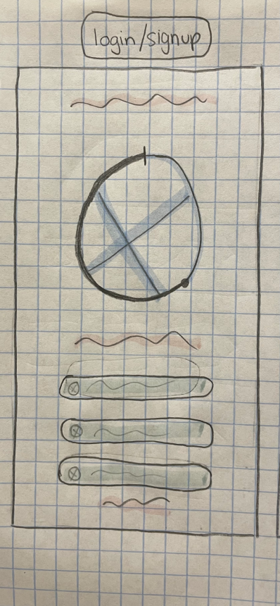
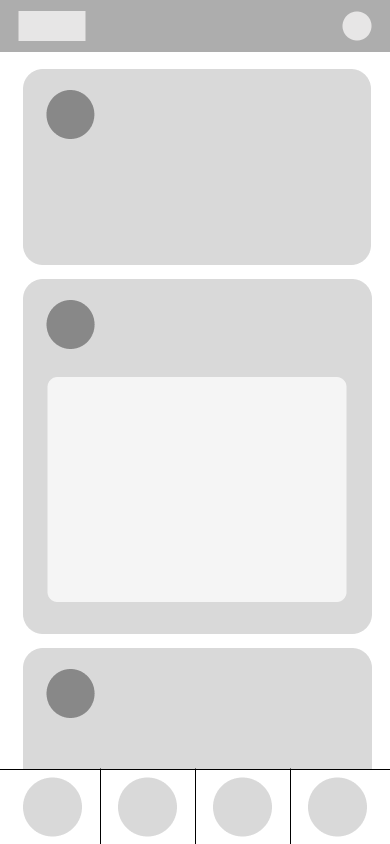
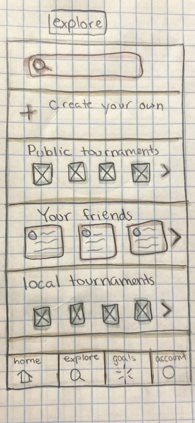
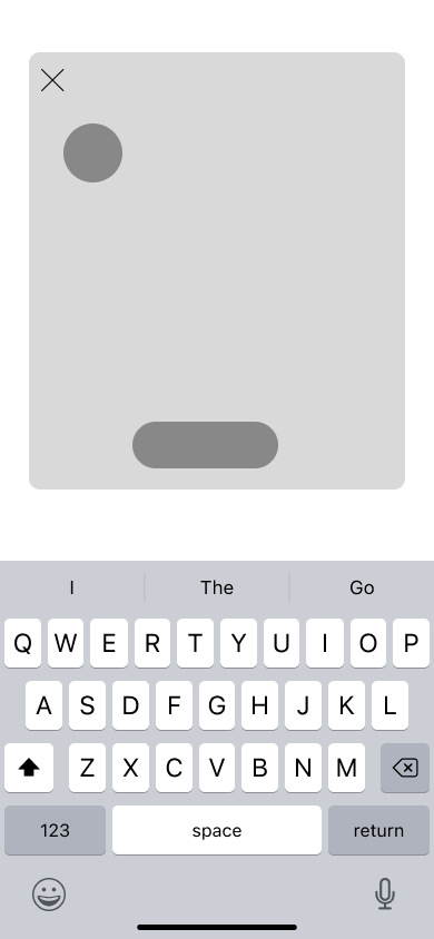
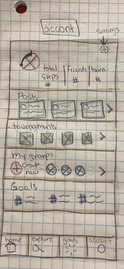
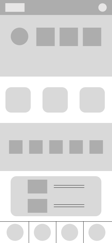
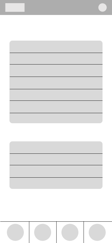
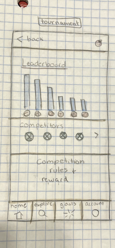
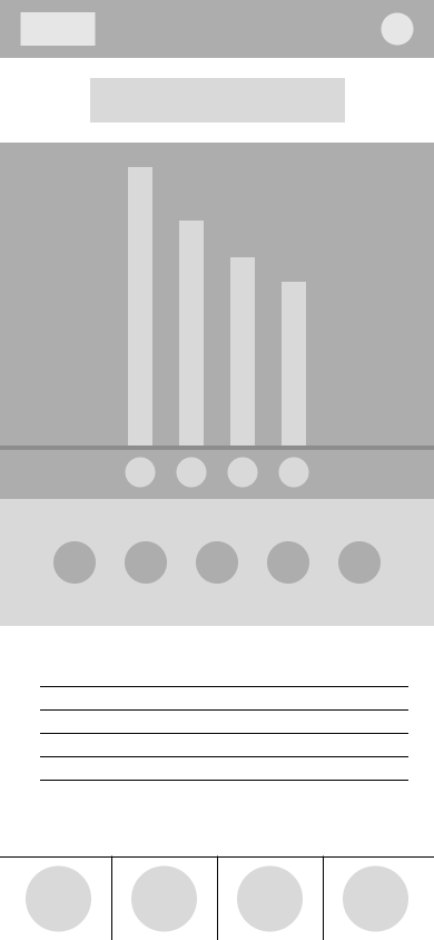
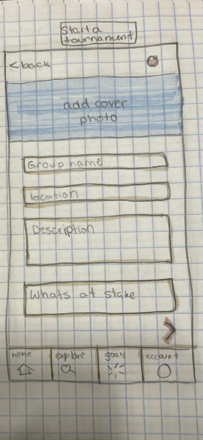
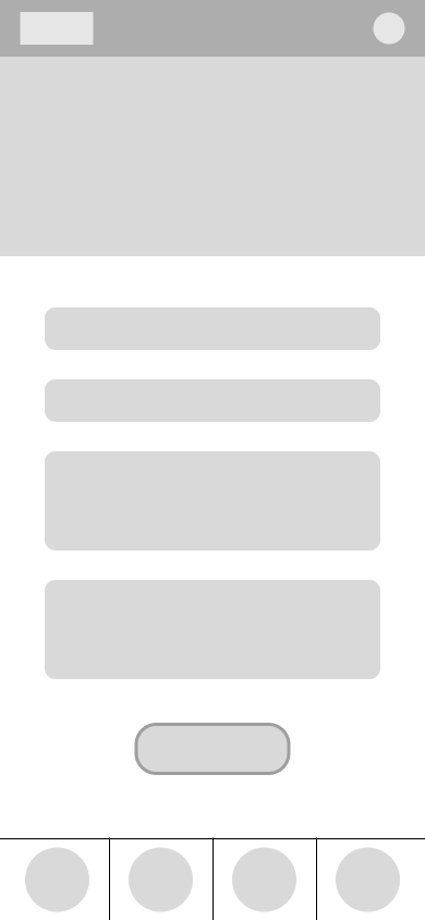
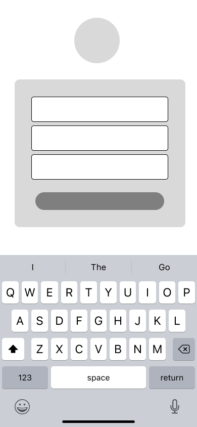
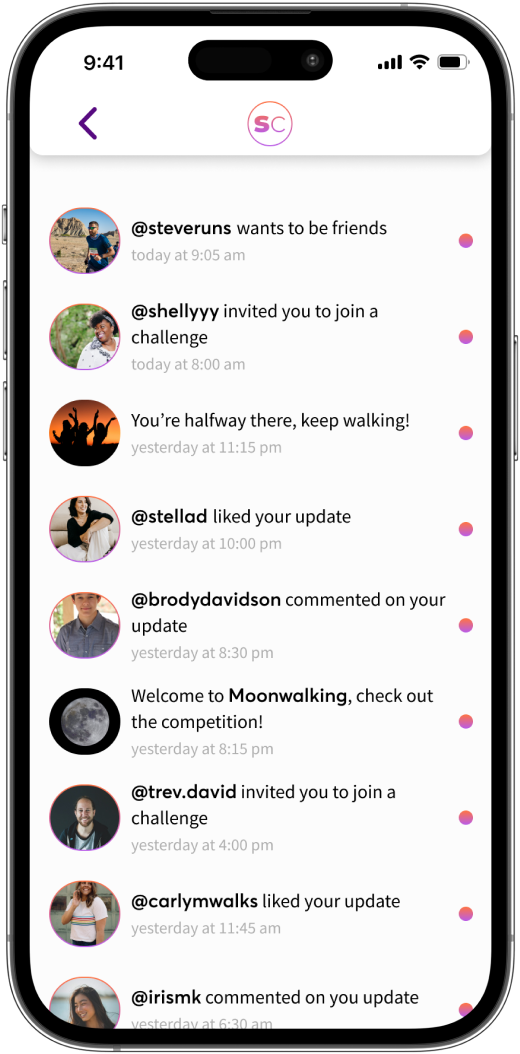
These preliminary sketches represent a few potential screens. The following are sketches and low-fidelity wireframes for the home screen, explore screen, user account, challenge screen, create a challenge screen, and login screen.
Style Guide
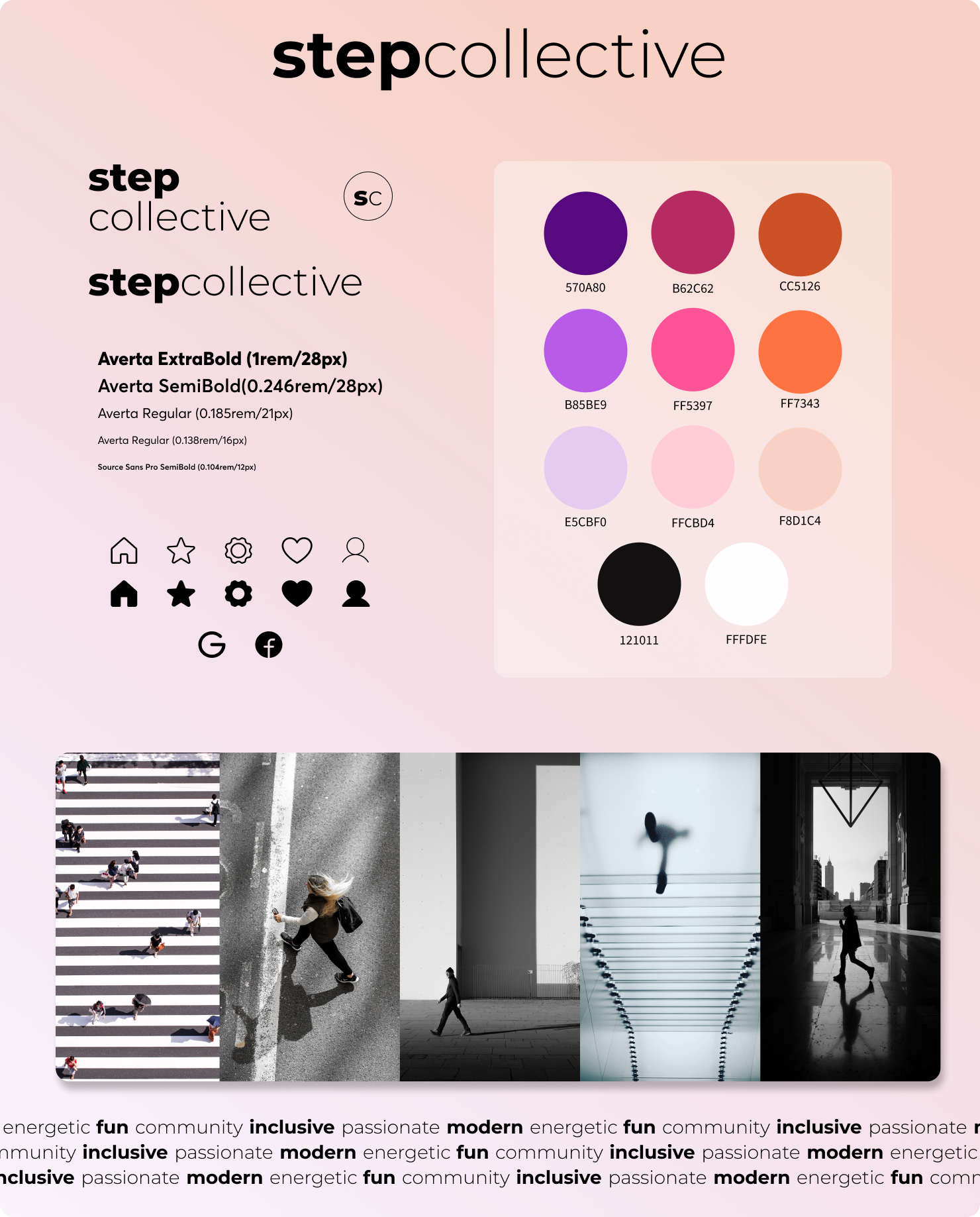
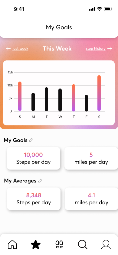
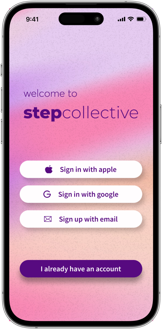
StepCollective is a unique and modern brand passionate about movement, inclusivity, and having fun. The colors chosen reflect these qualities by being bright and energetic and are balanced with neutral tones within the design to maintain a modern and sleek aesthetic. The fonts used in the StepCollective app are Averta and Source Sans Pro; both modern, simple, and readable sans-serif fonts with a modern aesthetic.
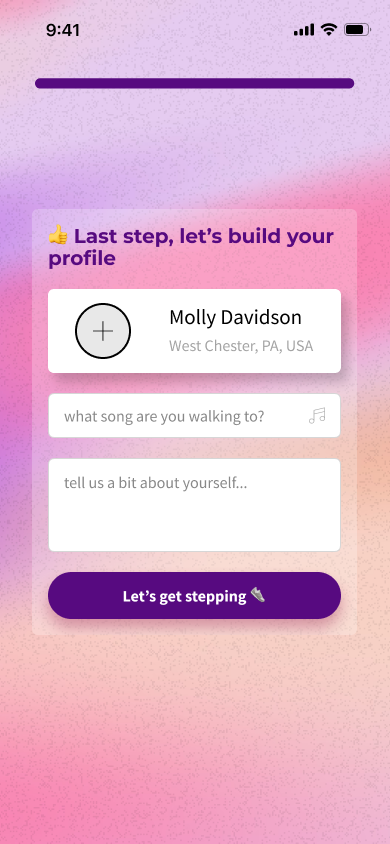
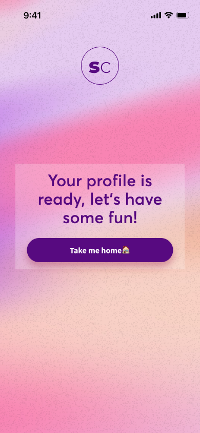
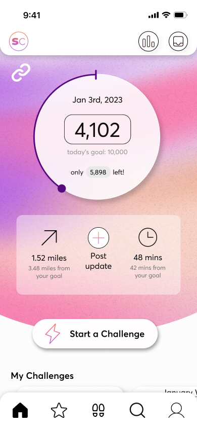
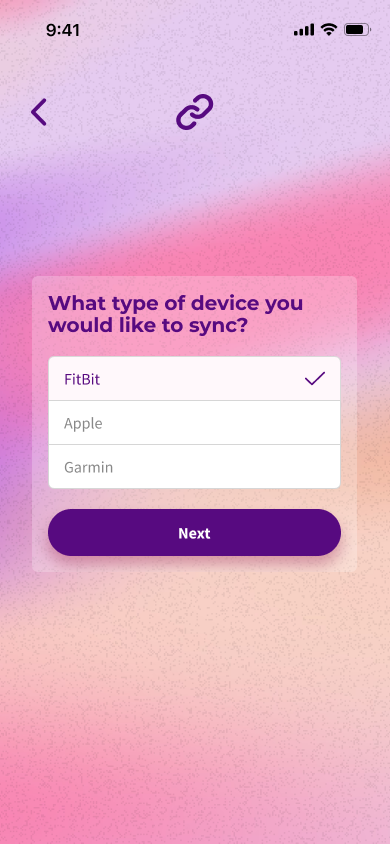
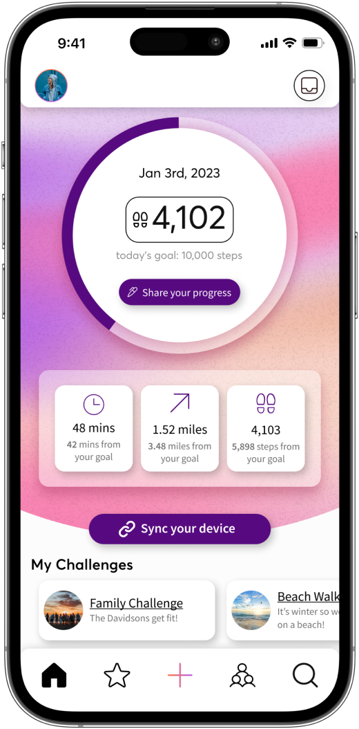
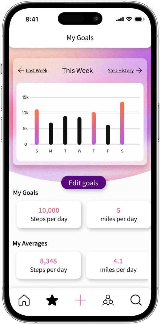
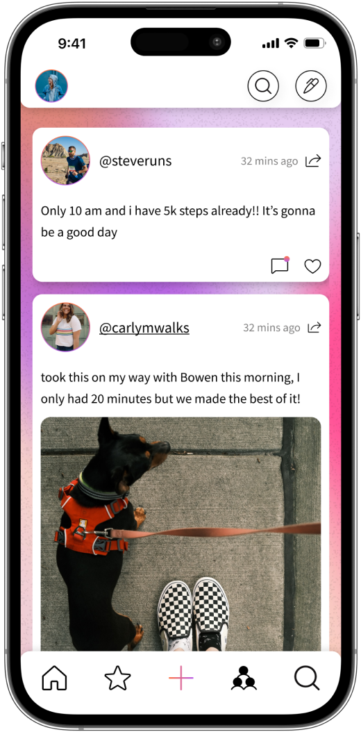
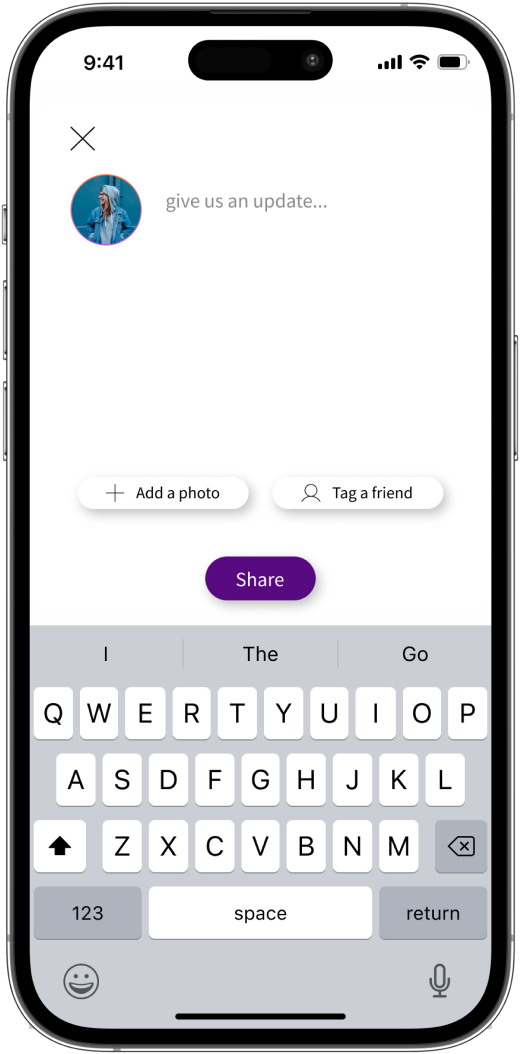
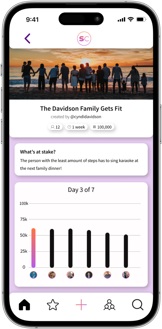
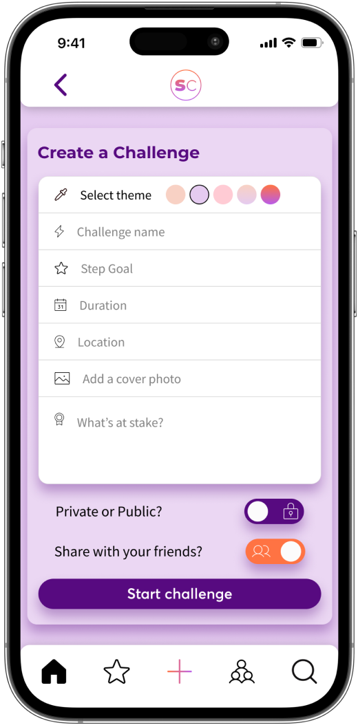
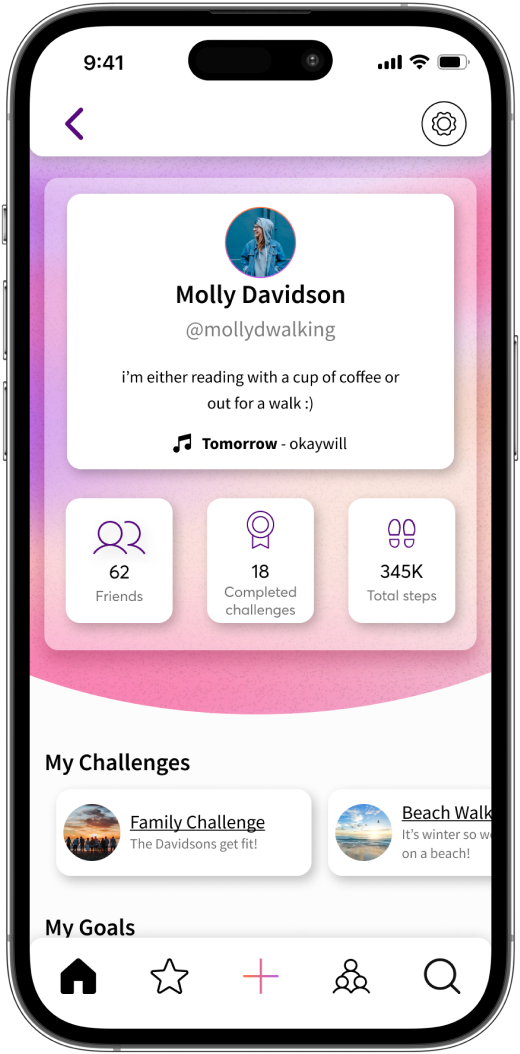
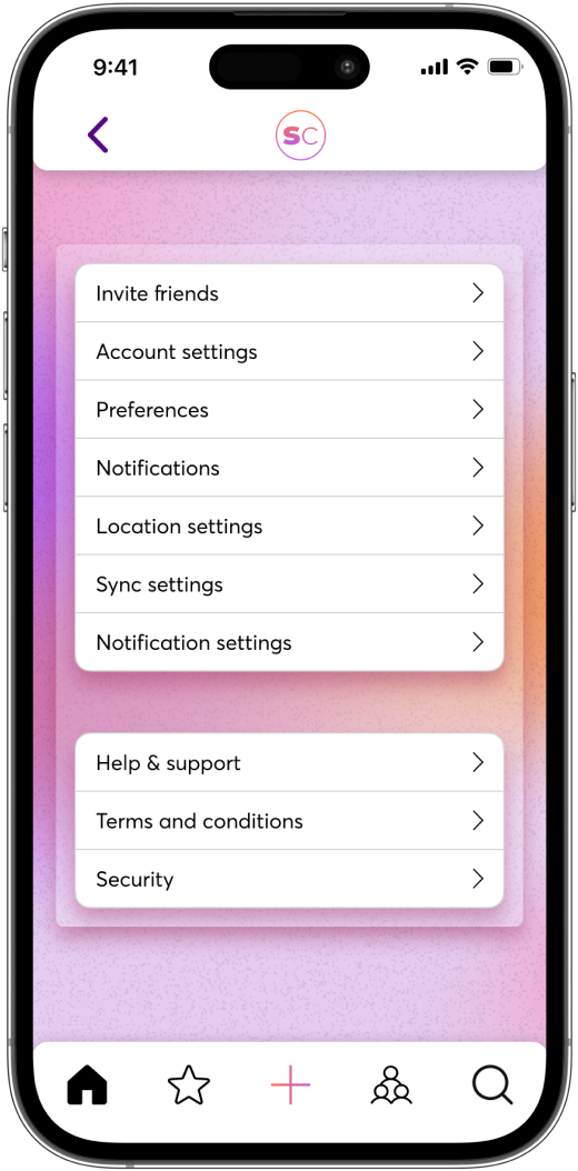
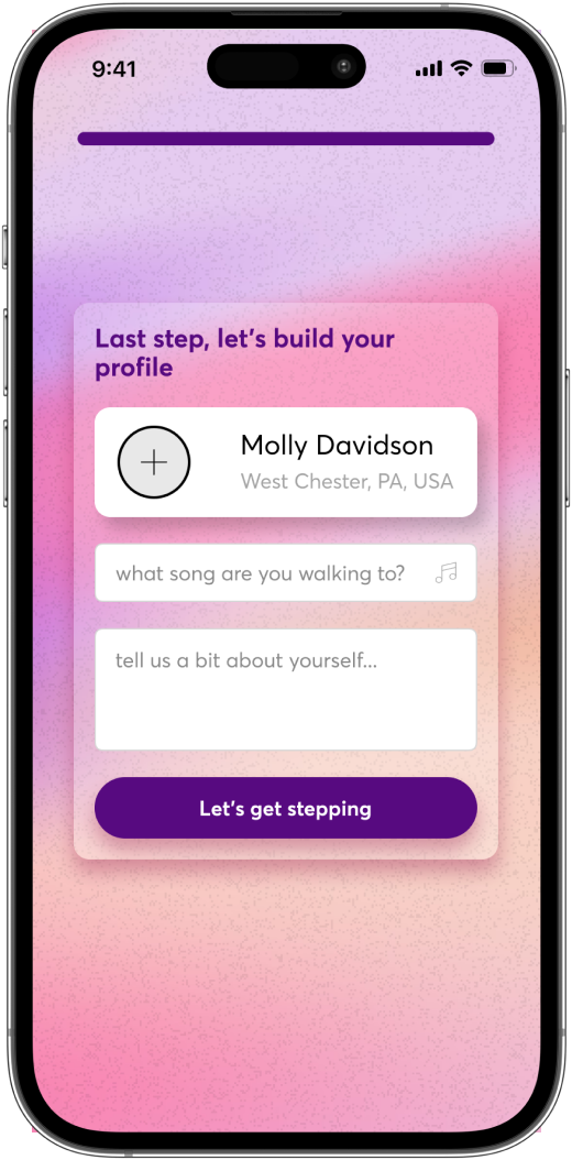
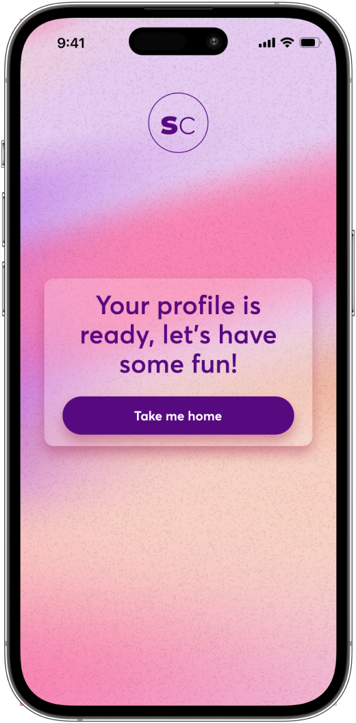
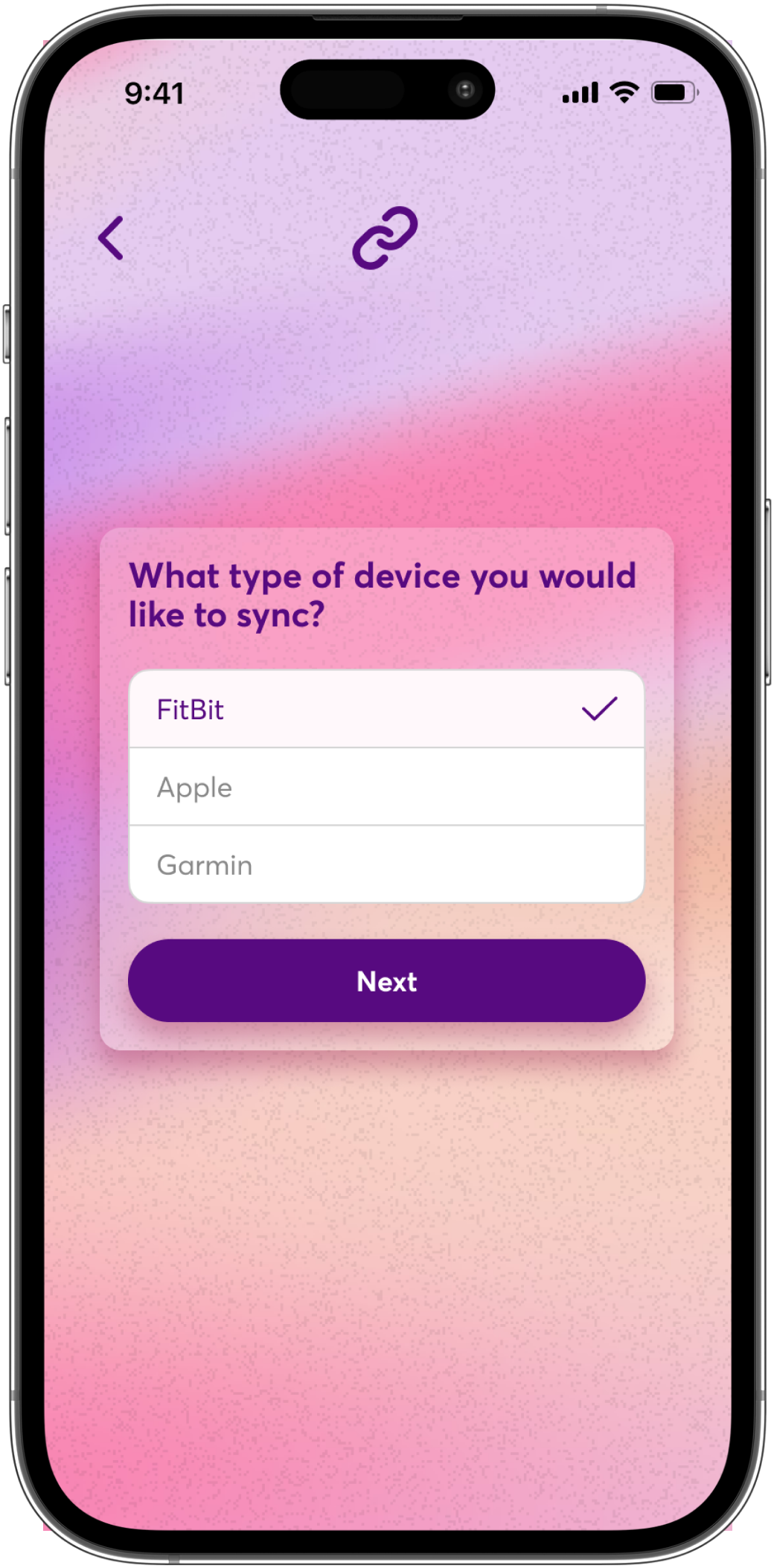
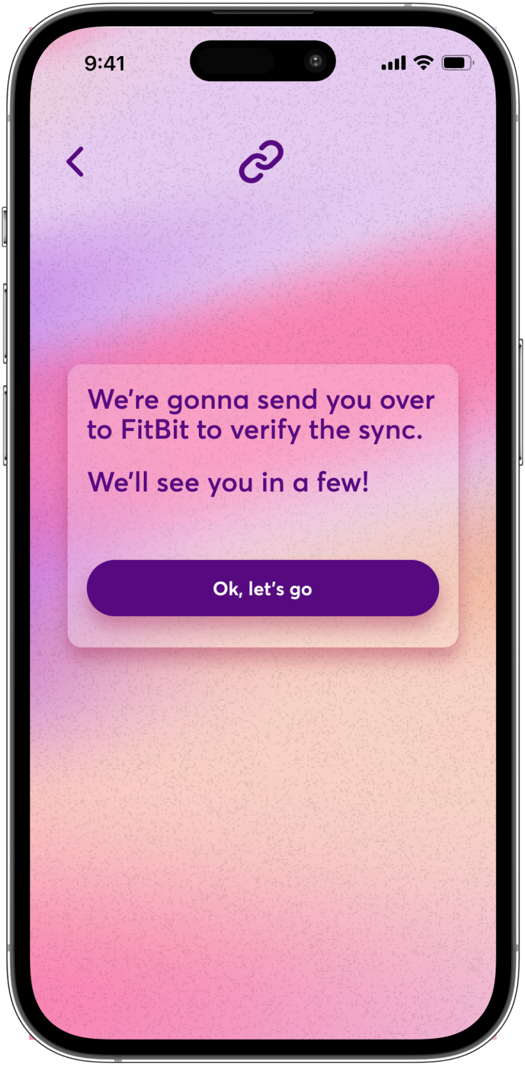
High Fidelity Wireframes
Test & Iterate
Usability Testing
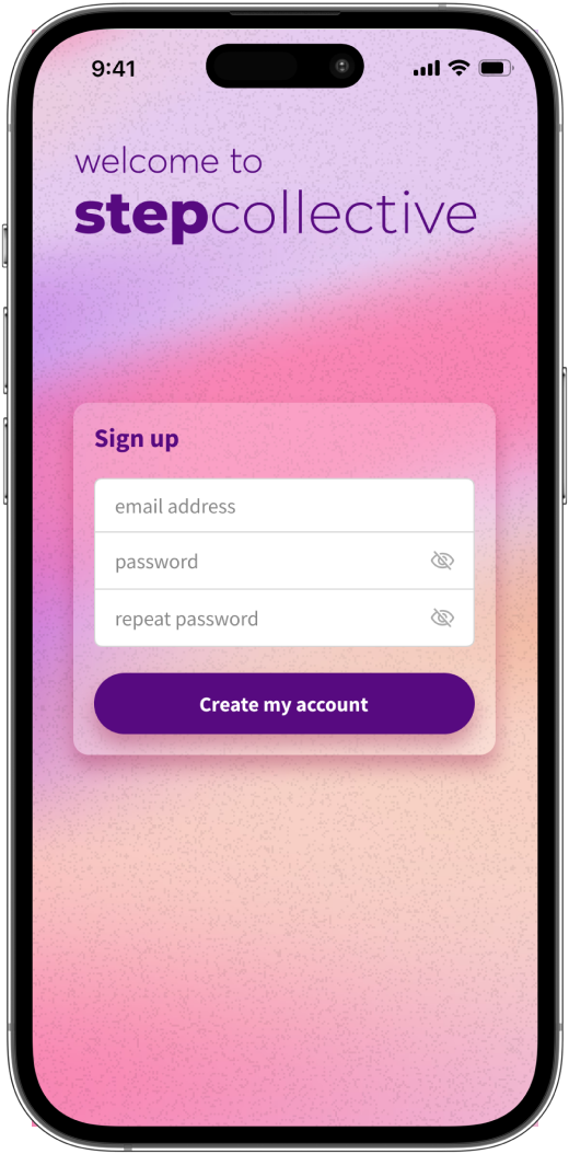
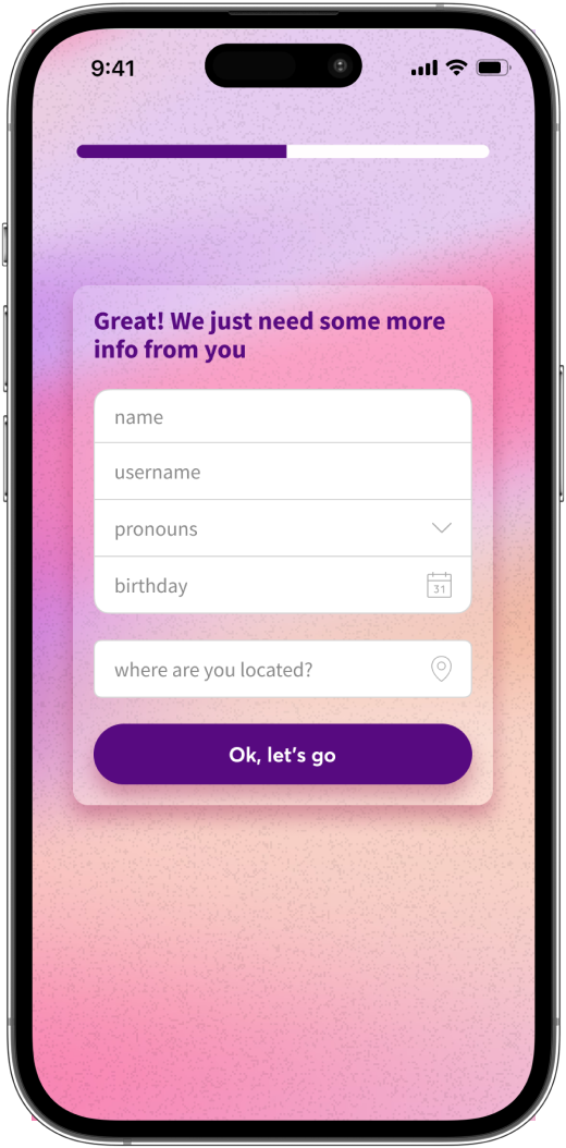
I tested 3 different task flows with 4 users. Below you will find examples of the 3 flows the users worked through.
Flow 1:
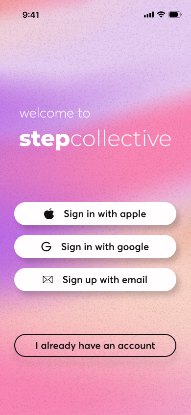
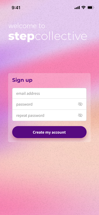
Sign up via email
Determine ease of use
- Flow 3 was the easiest task to perform, it was the shortest flow and the one with the least amount of clicks
- Some minor confusion on buttons was discussed and these issues will be addressed during iterations
- No notable errors took place
Determine Memorability
- Memorability was improved after running through the flows and working with the prototype
- Innate memorability was relied on for each initial flow and was successful
Determine any points of common error of confusion.
- The main concerns are about the navigation bar - the feed icon caused some initial confusion, users mistook the icon for steps taken, not for their community feed
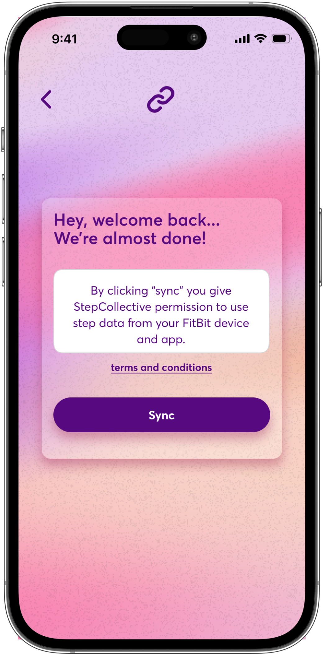
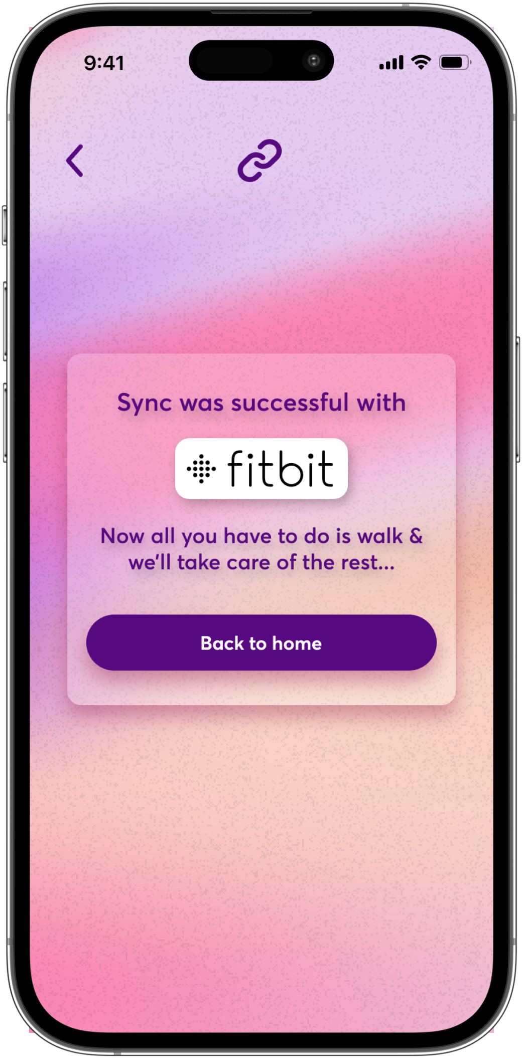
- Some users had problems finding the sync button
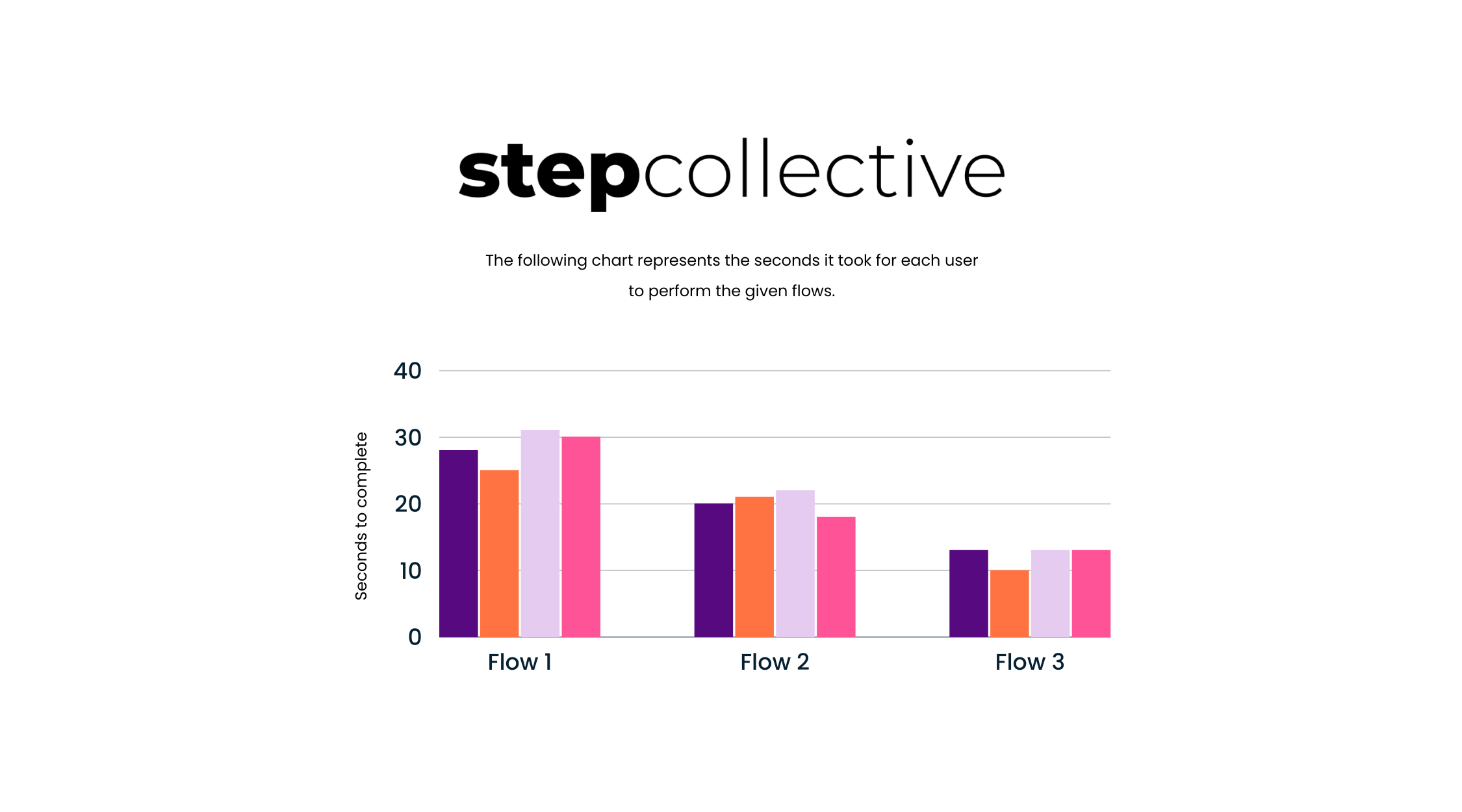
Determine how quickly users can complete a given task
Flow 1 - 28.5 seconds
Flow 2 - 20.25 seconds
Flow 3 - 12.75 seconds
*These numbers are the average of all 4 users
Success Metrics & Results
Goal:
Result:
Increase in engagement among both types of users
Increase interest of non-fitness focused users
Low Error Rate During Use
With the data and metrics collected, users will spend an estimated 120% more time engaging within Step Collective compared to competitors.
100% of socially-focused users noted a higher interest in the app after compared to other competitors
After initial iterations were made, error rates decreased by 86%
Notes & Improvements
- Adding a consistent share button to challenges and feed posts.
- Minor cosmetic changes (addressing any readability issues, over/underlays, balance, etc.)
- Changing the feed icon - due to some confusion over what the center (footprint) icon was for, I made the decision to change it to something more recognizable to users.
- Adding text to sync button for easier distinction
Iterations
There were quite a few versions that I edited, prototyped, and tested. Here are some of the most notable changes that were made:
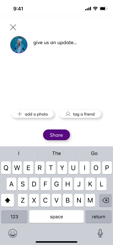
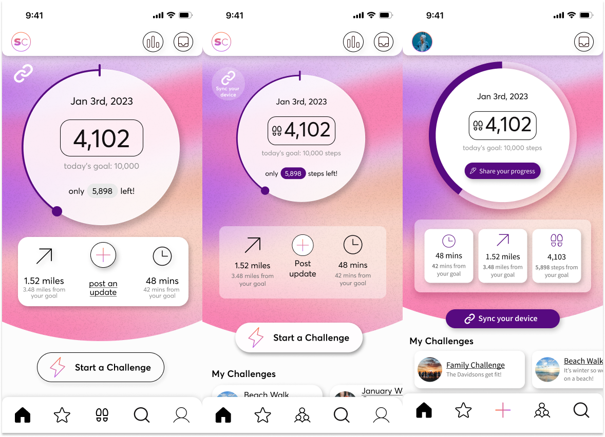
1. Organization, Clarification, and Prioritizing Actions: The profile button from the bottom navigation bar to the top navigation makes room for an action button. This action button gives the user a shortcut to post an update, join a challenge, or create a challenge. Through this, I was able to prioritize all 3 primary actions so a user doesn't have to navigate to accomplish their goal.
During the first round of testing, there was also confusion on two main buttons: the sync button on the home page and the social feed button in the bottom navigation.
20% of users were able to find the sync button without help and 0% understood the footsteps icon as the social feed button.
Changes were made to get these metrics to 100%.
2. Accessibility and Aesthetics:
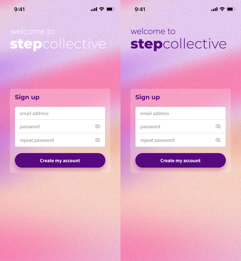
"I can't really read what that says."
That sentence from a user was cause to make some changes Though these changes are seemingly minor they were a priority of mine to change. To the right is an example of where I changed the text coloring from white to a deep purple which provided much more contrast between the text and the background.
All buttons were made the same style and color.
Typeface was changed: now all text is Source Sans Pro in varying weights and sizes
The little things: spacing was adjusted to make the screens feel less crowded and busy, shadows were added to provide depth, and all corners were rounded to the same radius.
Conclusion
I can honestly say that this design project provided me with the most valuable lessons I have recieved since beginning my UX design career. Creating an end-to-end app concept and design in 6 weeks forced me to rely on my skill set and hone in on what is truly important to a product and its perspective users. Maintaining focus on the task and the brand ideals that I established allowed me to get creative and design a product, unlike anything I’ve made before.
The concept was brought about by a casual conversation I had with my friends - some of us have FitBits and some have Apple Watches - we were trying to find a way to compete with each other in step challenges but couldn’t find a great solution. And while StepCollective is far from being a functional app it was fun to design something I would enjoy as a user.
I hit a little bump in the road about halfway through designing the high-fidelity wireframes and I was not happy with the direction I was going. I decided to keep a few elements that were working and rework everything else. Though this set me a little behind and forced me to go back to the drawing board, it was the best decision I could have made. This is where I decided to have a little more fun with color and came up with the signature gradient that you see all over the interface. Though this forced me to put extra hours into the project it was a necessary turning point.
Figma was my primary tool in this design. I got to play around with plug-ins that I had never used before and it truly elevated my design abilities and gave me a lot of inspiration not just for this project but for future designs as well. Creating StepCollective really allowed me to sharpen my prototyping abilities to make the wireframes come to life and function in a way I would like the app to perform.
The next steps for this design would be wireframing more screens and testing more complex tasks to further establish how well users respond to the design and receive more feedback. I truly had a lot of fun with this design project and hope that shines through. It forced me out of my comfort zone and let me stretch my design skills and help me grow as a designer.
✦ let's connect ✦
Sophie Burt | 2023

